Timeline
November 2024 - May 2025
Role
Visual Design Lead
Industry
Food Manufacturing
Fifty Years of Flavor,Redesigned for the Digital Age
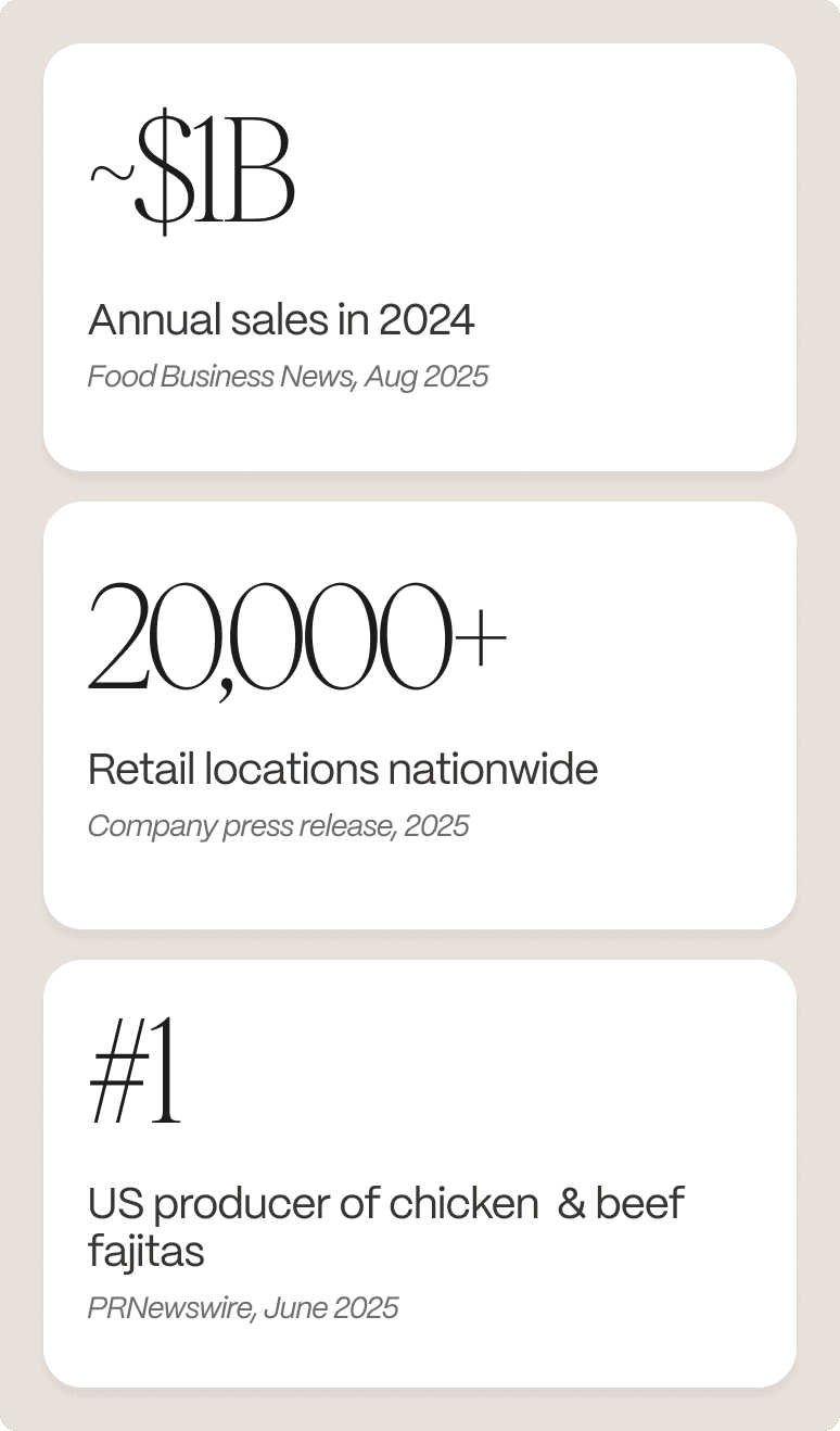
John Soules Foods is a family-owned, Texas-based company specializing in fully cooked and raw chicken and beef. Since 1975, it has grown from a regional supplier into a nationally recognized brand available in over 20,000 retail locations — serving both professional kitchens and home dinner tables across the U.S.

The challenge
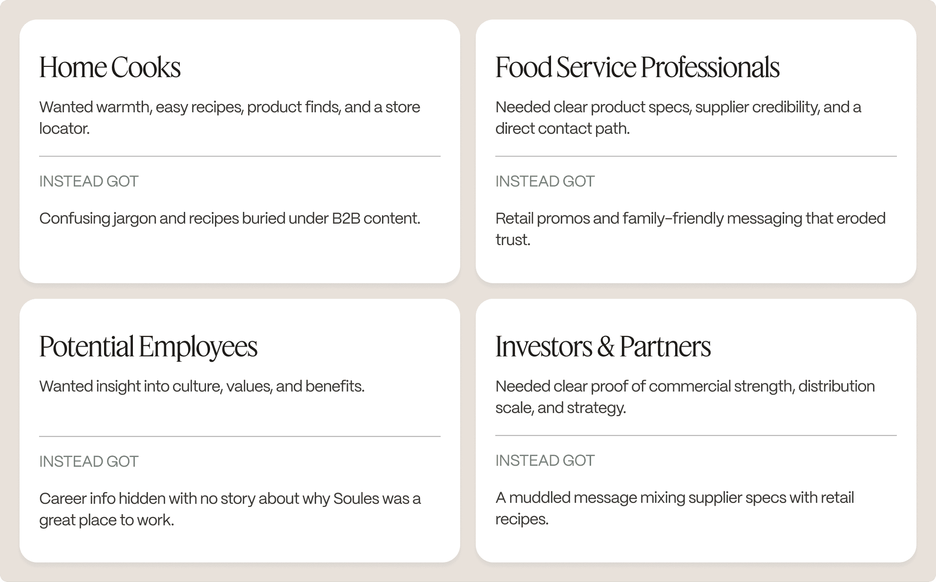
One website trying to speak to everyone — and connecting with none of them.


The Strategy
The obvious solution was to fix the existing site. We didn't do that.
One site serving four audiences wasn't a content problem — it was a structural one. No reorganization would resolve the tension between a home cook browsing recipes and a foodservice director evaluating a protein supplier. They needed different things, in different headspaces, for entirely different reasons.
The decision: split the digital presence entirely. Two purpose-built platforms, each designed for a single audience, held together by a single design system.
The Two Brands
Combining these needs on one site caused friction: B2B sections sat next to home cook content, product pages blended technical and casual messaging, and recipes were hard to find. With no clear goal, calls to action competed for attention, leaving no group with a satisfying experience.
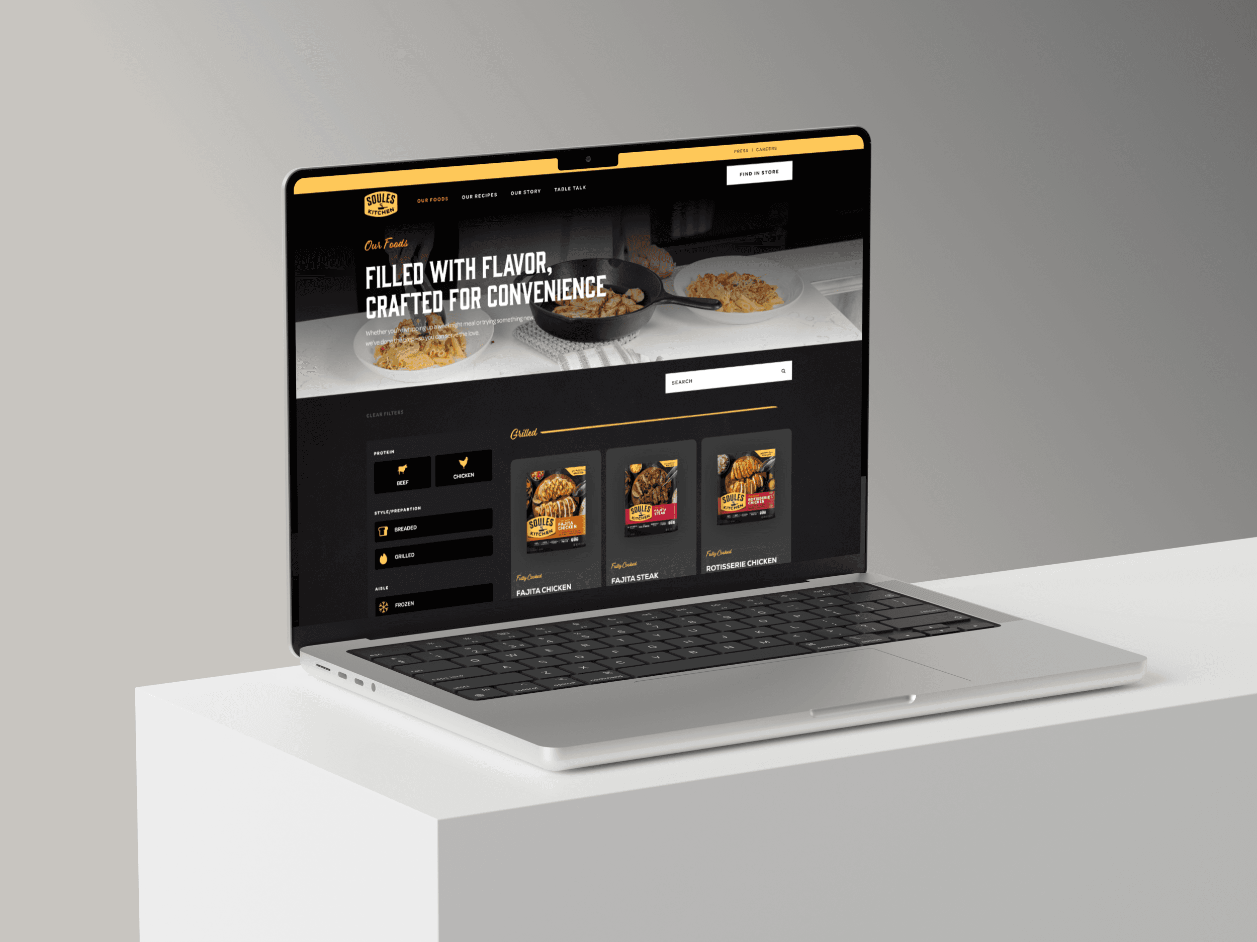
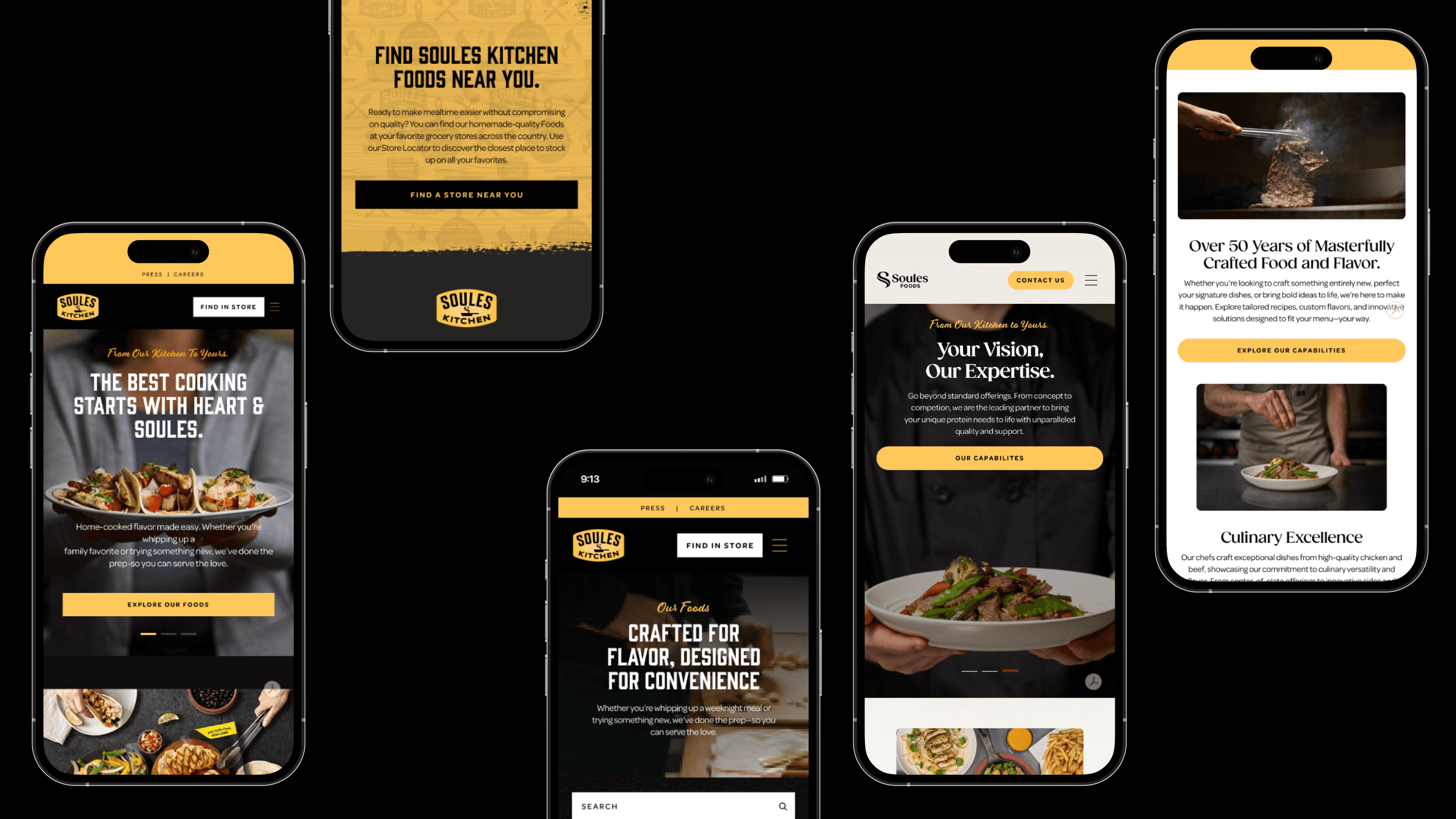
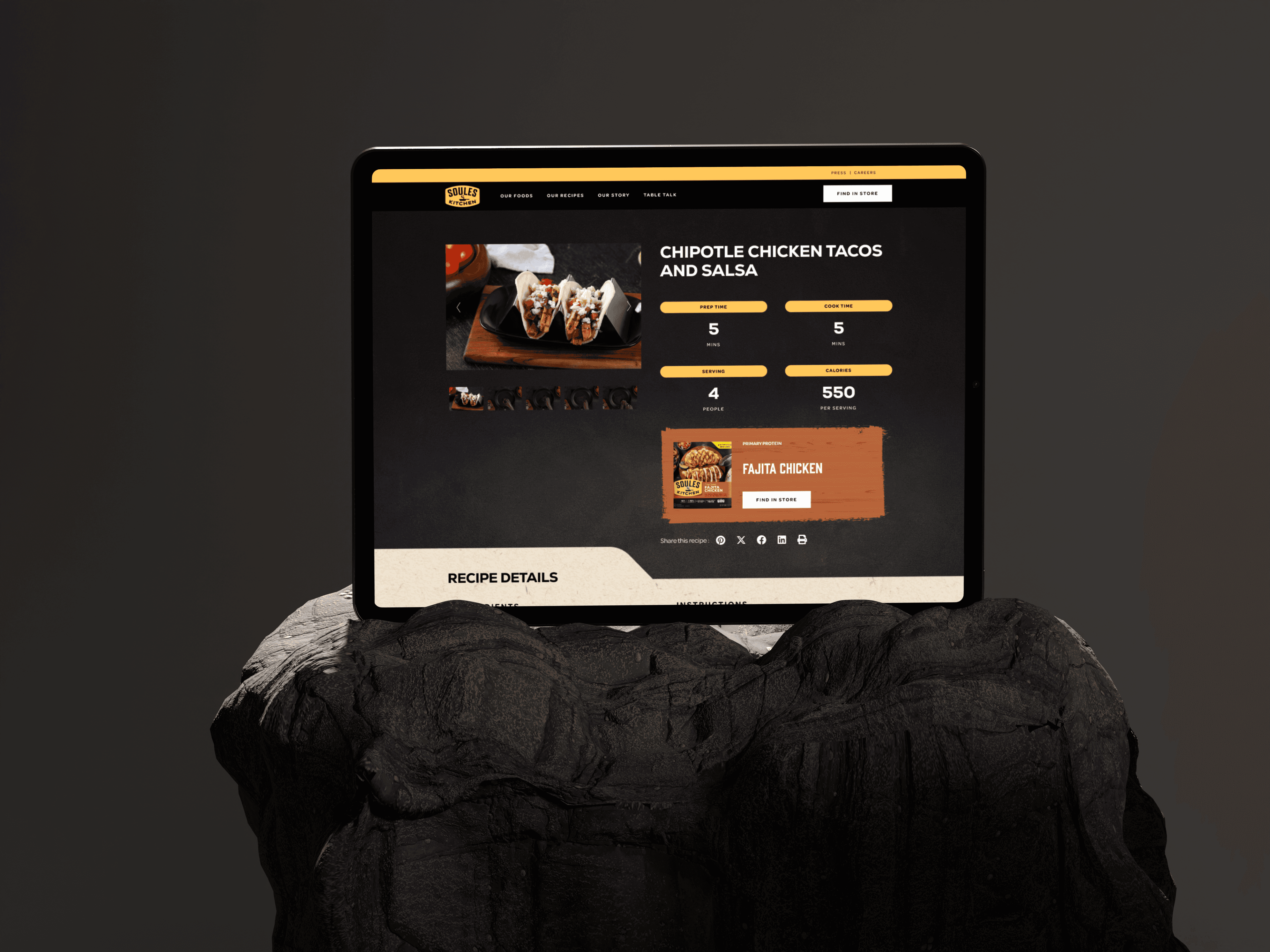
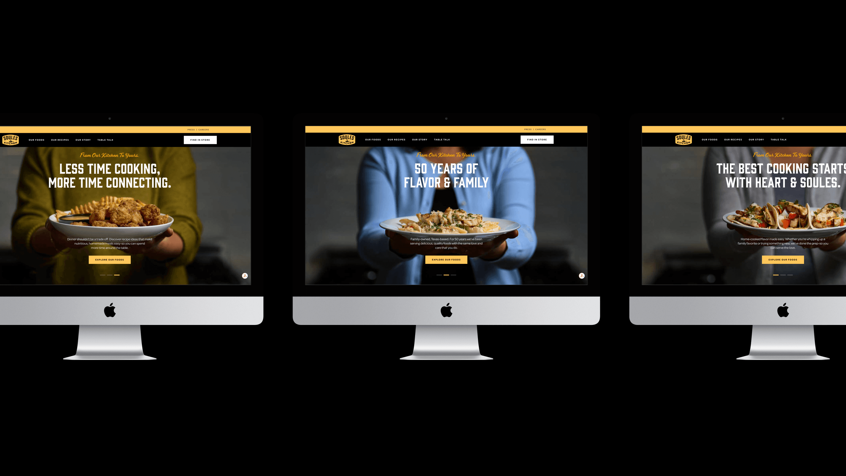
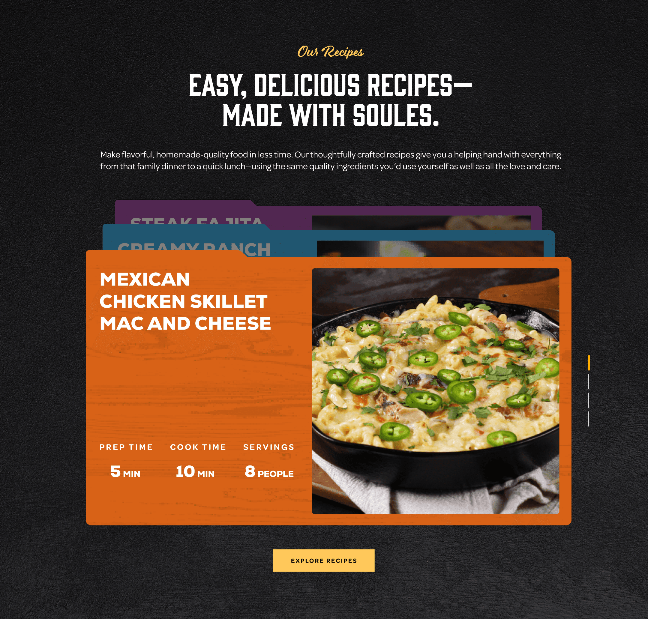
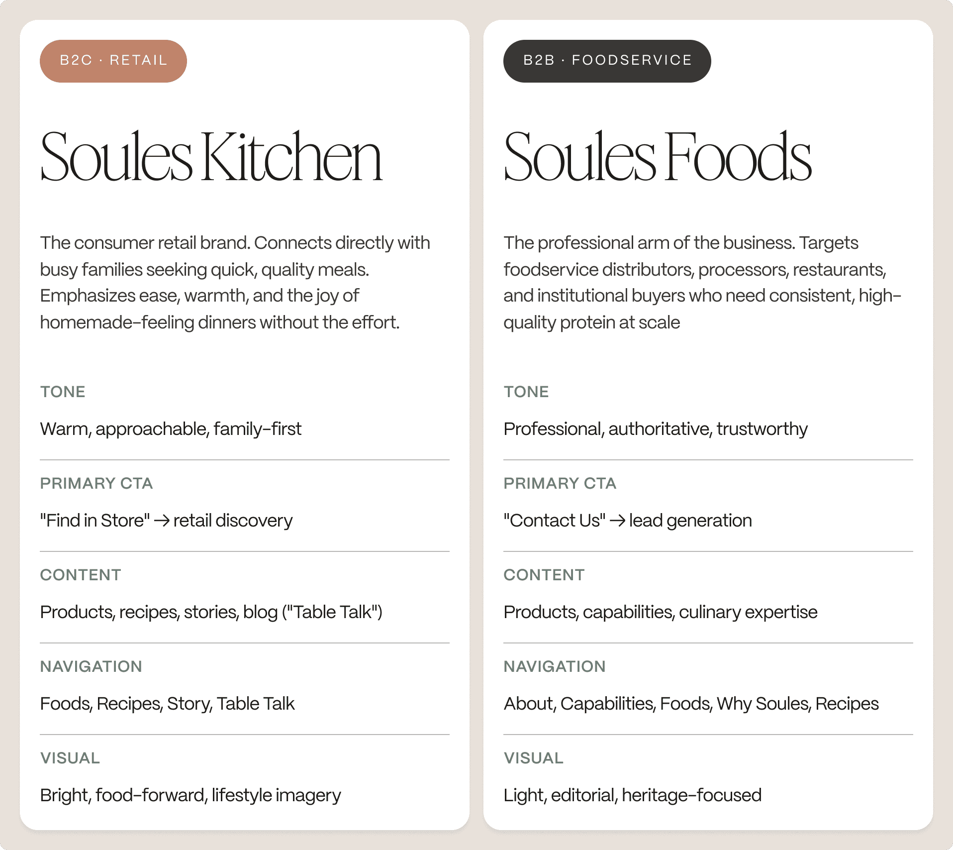
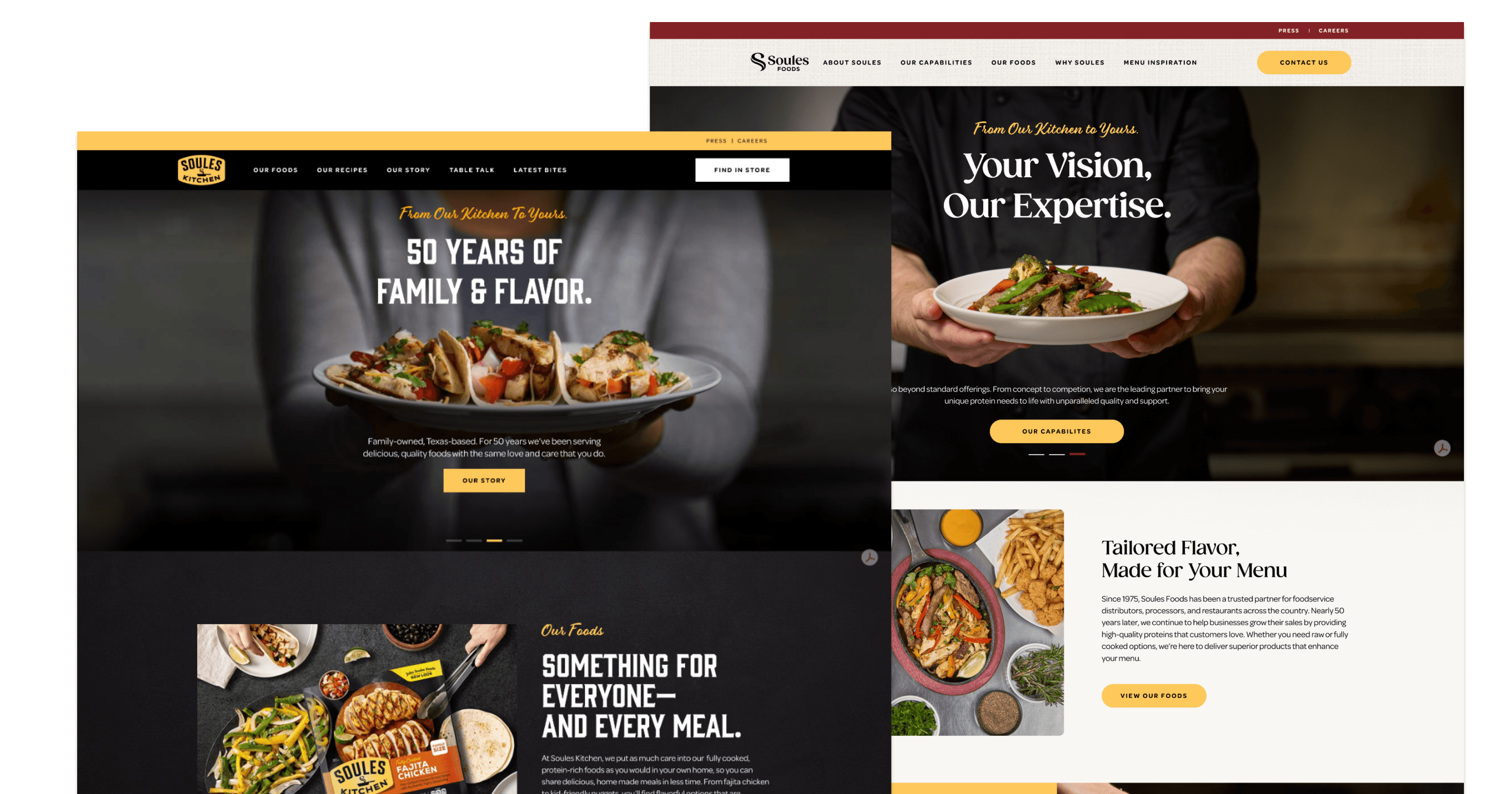
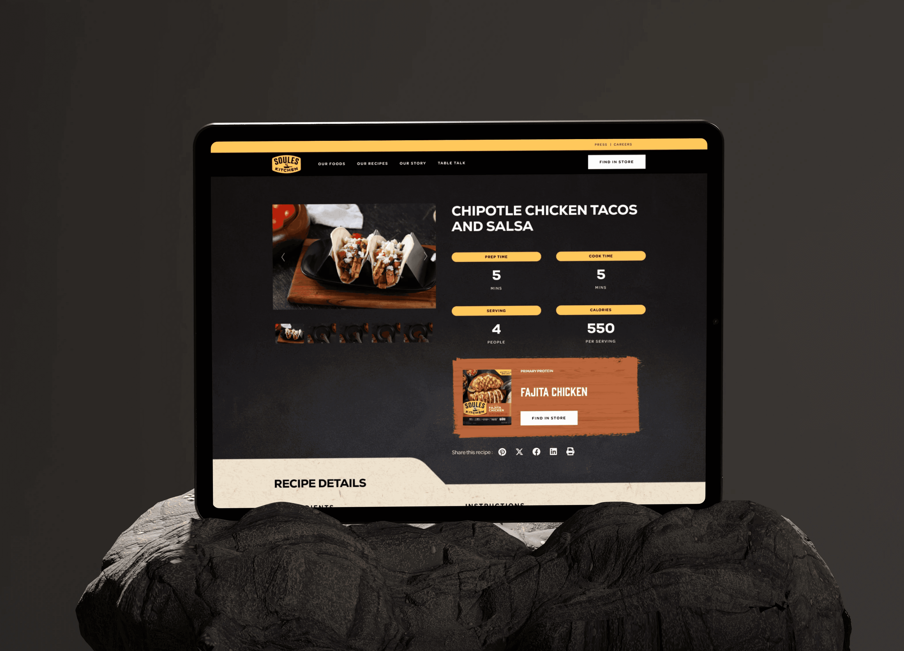
The web experiences of Soules Foods and Soules Kitchen elicit different psychological responses: one fosters feelings of trust and efficiency, while the other inspires a sense of sensory delight. Together, they represent two sides of the same coin, using contrasting visuals to weave a cohesive narrative. The sites are designed to contrast—one in black and the other in white—effectively distinguishing the source (the people) from the result (the food).
The Solution
Soules Foods and Soules Kitchen share a heritage and a kitchen — but they speak entirely different languages. The strategy was to honor that difference completely rather than compromise it.
The solution was a deliberate visual inversion: Soules Foods in black, centered on people and craft. Soules Kitchen in white, centered on the food. Not just a color swap — a complete divergence in imagery direction, typography weight, navigation architecture, and emotional register. Two sides of the same coin, using contrast to tell a unified story.
Both platforms were built on a single shared design system — ensuring long-term coherence across the brand and giving the client's internal team the ability to maintain both sites without breaking consistency post-launch.
THE PROCESS
Three directions. One recommendation.
The brief was simple: two sites, same family, but feeling like opposites. Opposites can mean many things. We developed three directions, each testing a different answer to that question.
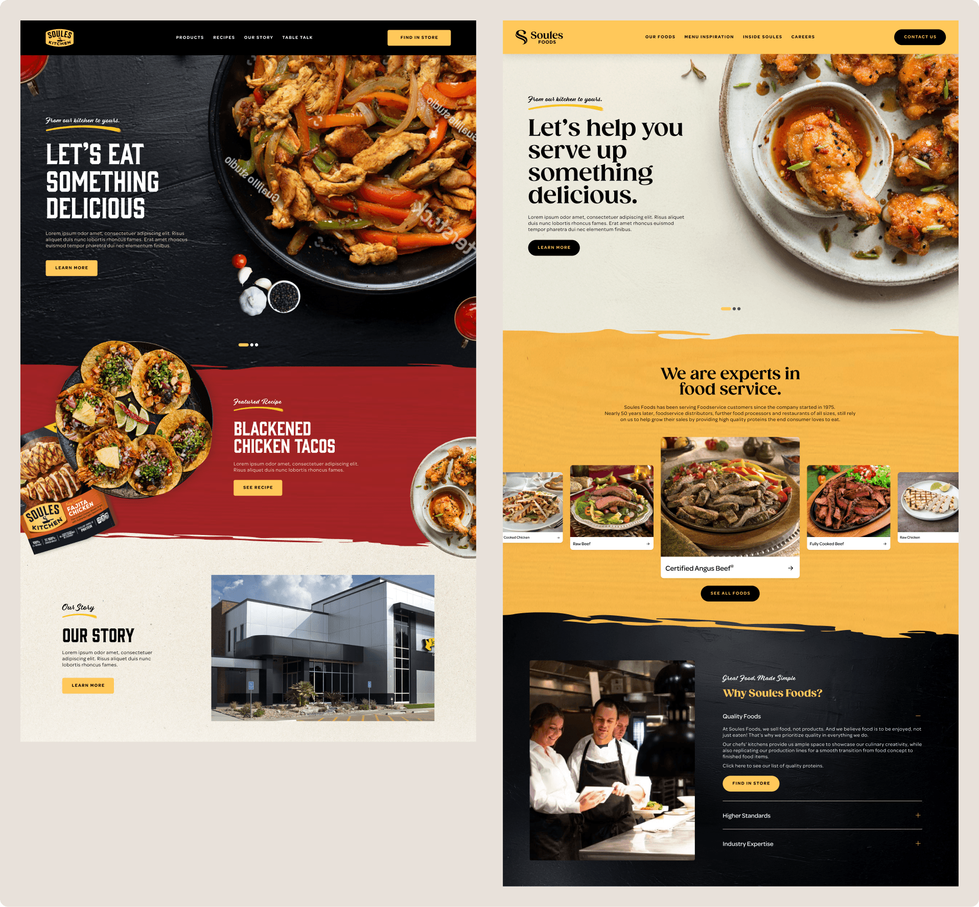
Concept 01 — Eat the website Bold, food-forward energy across both platforms. High visual impact, but both sites shared too much DNA — the contrast between B2B and B2C was tonal, not structural. Insufficient to serve genuinely different audiences.
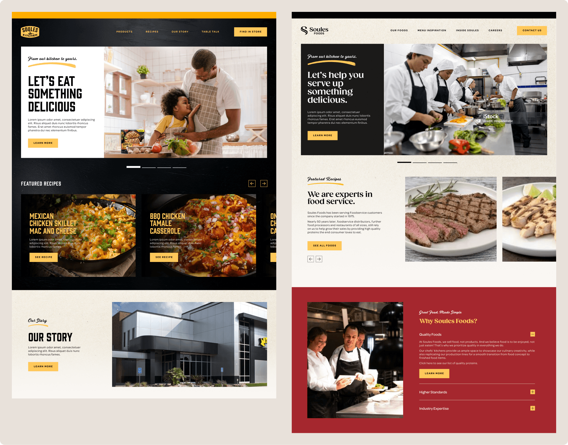
Concept 02 — Refined, lifestyle-led, cleaner, and more differentiated. B2B began separating with a professional cream palette; B2C got warmer. Stronger than Concept 01, but the two platforms still felt like variations of the same thing rather than distinct experiences.
Concept 03 — Full inversion. White B2C centered on the food. Black B2B focuses on the people and craft. Contrast through meaning, not just color. Recommended and chosen.
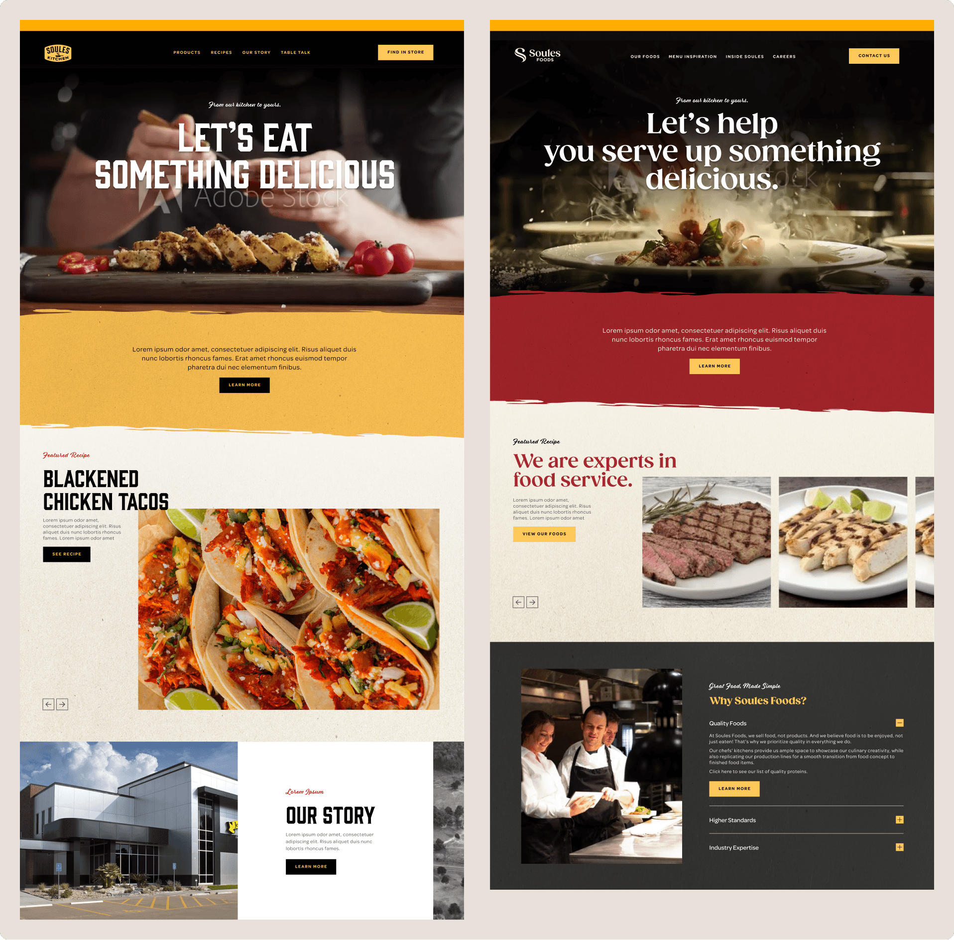
The key distinction we made in the recommendation: Concepts 01 and 02 created contrast through tone. Concept 03 created contrast through meaning — one site centered on the result (the food), one on the source (the people and craft). The client chose Concept 03.
The Outcomes
Both platforms were launched on June 9, 2025, coinciding with the company's official public rebranding announcement. This marked the first time the world saw the new names: Soules Foods and Soules Kitchen. For a $750 million company, recognized as America's #1 fajita brand, this was a generational statement about its vision for the next 50 years.
The sites needed to reflect that momentous occasion. The client responded enthusiastically to both platforms, particularly appreciating how the visual contrast reinforced the brand's dual identity without causing fragmentation.
The shared design system also provided an unanticipated advantage: a maintainable, coherent foundation that the internal team can expand without compromising brand consistency across more than 20,000 retail locations nationwide.
the Learnings
Test the inversion with real users early on — The three-concept direction was validated by the client but not by foodservice buyers or home cooks. Conducting user testing earlier would have confirmed whether the black-and-white split effectively conveyed "authority" and "warmth" to the intended audiences, considering both aesthetics and functionality.
Define the design system before visual exploration, not afterward — The shared system was developed only after the client selected this direction. Starting with system constraints from the beginning would have expedited concept exploration and led to a cleaner final handoff.
Establish post-launch measurement from day one — The sites were launched without a clear framework for defining success in the first 90 days. For the next brand split of this scale, I would incorporate baseline metrics—such as time on site by audience, CTA conversion by platform, and store locator usage—from the kickoff rather than as an afterthought