Timeline
October 2025 to April 2026
Role
Creative Director, Brand & Web
Industry
Hospitality
services
The Background
Founded in Boston in 1991 by Rachel Roginsky, ISHC—one of the nation’s foremost independent hospitality advisors—Pinnacle Advisory Group has earned a reputation for incisive, objective guidance spanning more than three decades. The firm has advised developers, lenders, institutional investors, and legal counsel on consequential hotel ownership and investment decisions, earning the confidence of clients ranging from global brands such as Marriott, Hilton, and Hyatt to boutique and independent properties.
In 2025, with Sebastian Colella joining founder Rachel Roginsky as Managing Principal, Pinnacle entered a new era—one that required an updated brand identity and digital presence aligned with the firm’s expertise and standards. The existing website failed to convey the quality of its achievements. Filling that gap became the principal challenge.
The Challenge
The mandate was clear: develop a logo to define Pinnacle’s next-generation identity and craft a website that articulates the firm’s value to a discerning audience—decision-makers responsible for multi-million-dollar hotel acquisitions, feasibility studies, and asset management strategies.
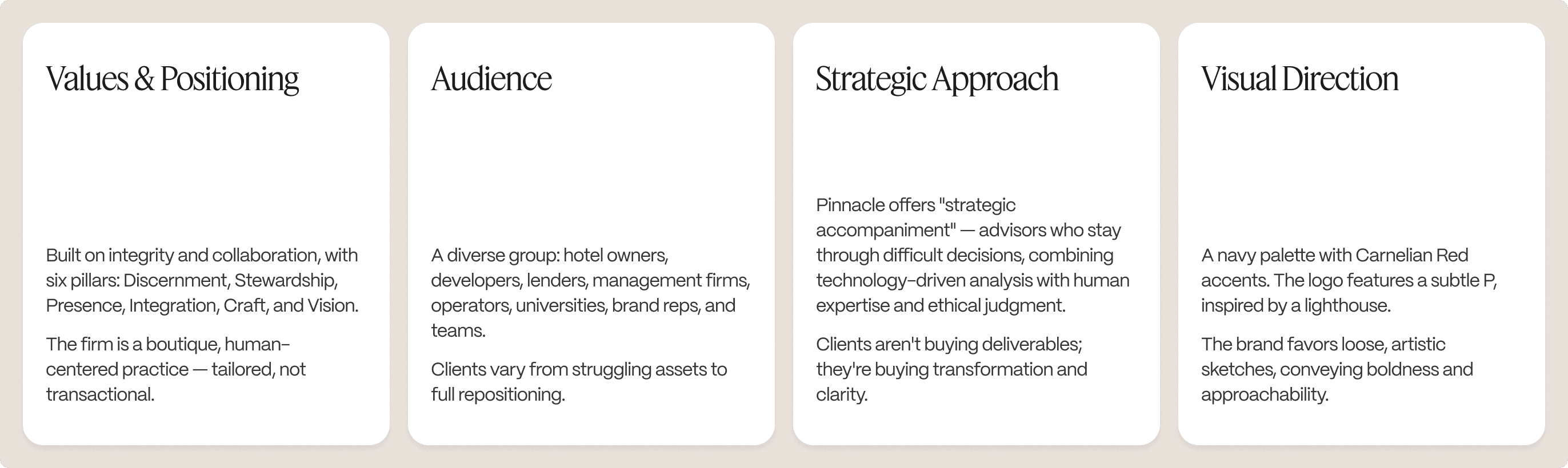
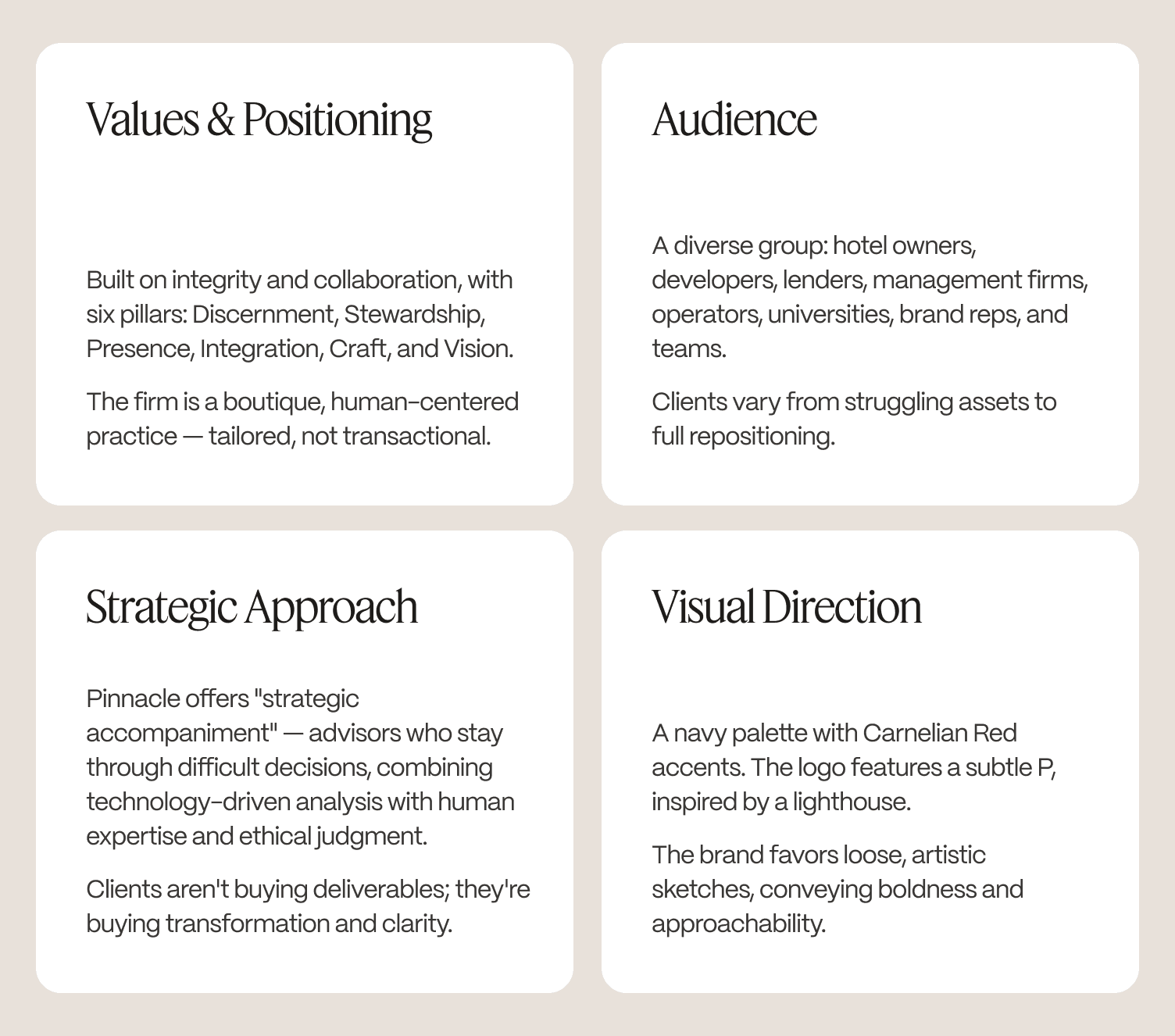
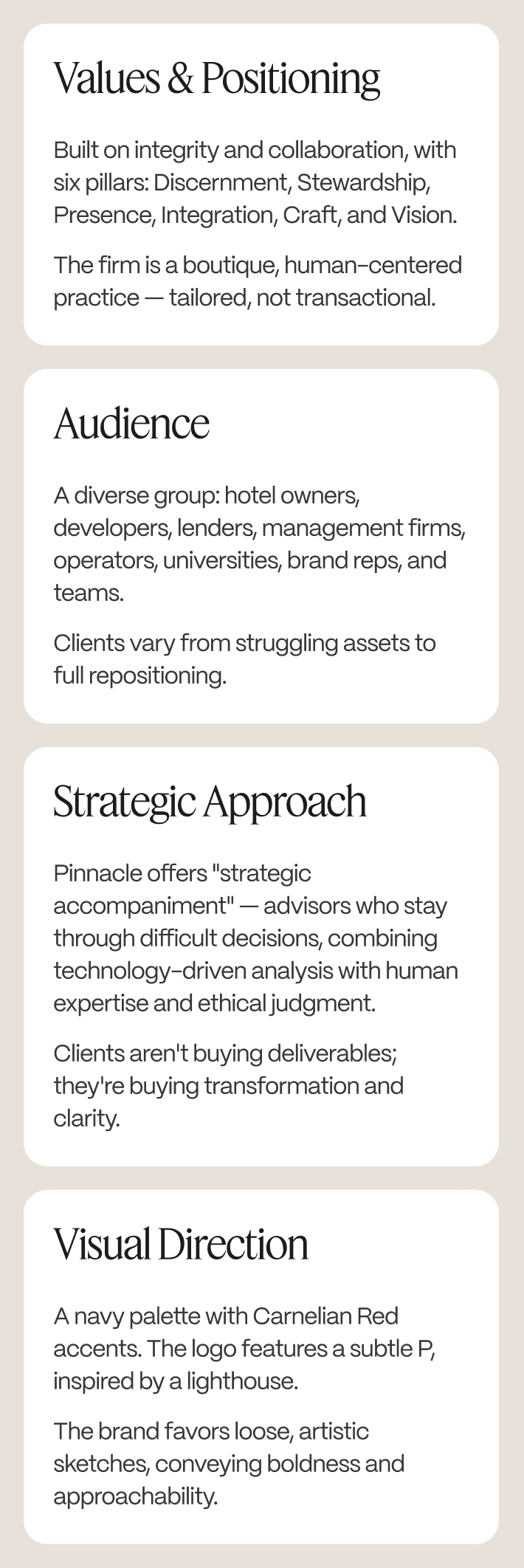
Hospitality advisory is a saturated market. Most competitors rely on generic corporate visuals, stock hotel imagery, and information-heavy layouts. Pinnacle stands apart because of its people—seasoned advisors with more than 25 years of experience, each bringing a fresh perspective to every project rather than a formula. The design brief became about making this distinction visible: establishing an editorial identity that exudes authority without coldness, and humanity without informality.
The greatest design challenge was knowing when to stop. With an arsenal of bold illustrations, deep navy hues, and editorial typography, the temptation was to let every element shine. Success lay in strategic restraint—subtracting rather than adding—to let the brand’s strengths speak for themselves.
The Strategy
The foundational choice that determined the project's success was to fully resolve the brand before approaching the web. With a cohesive identity established, the website's architecture and design unfolded naturally; without it, every layout would have felt tentative.
The result was two interdependent deliverables: a robust brand identity system anchored by a distinctive lighthouse logomark, and a multi-page Webflow website tailored for hotel investors, developers, and operators making high-stakes advisory decisions.
Developed in sequence and in close dialogue, the identity shaped the site's visual language, while the website's practical needs refined and extended the identity system. Each was strengthened by the other — neither would have achieved the same impact in isolation.
The Brandmark
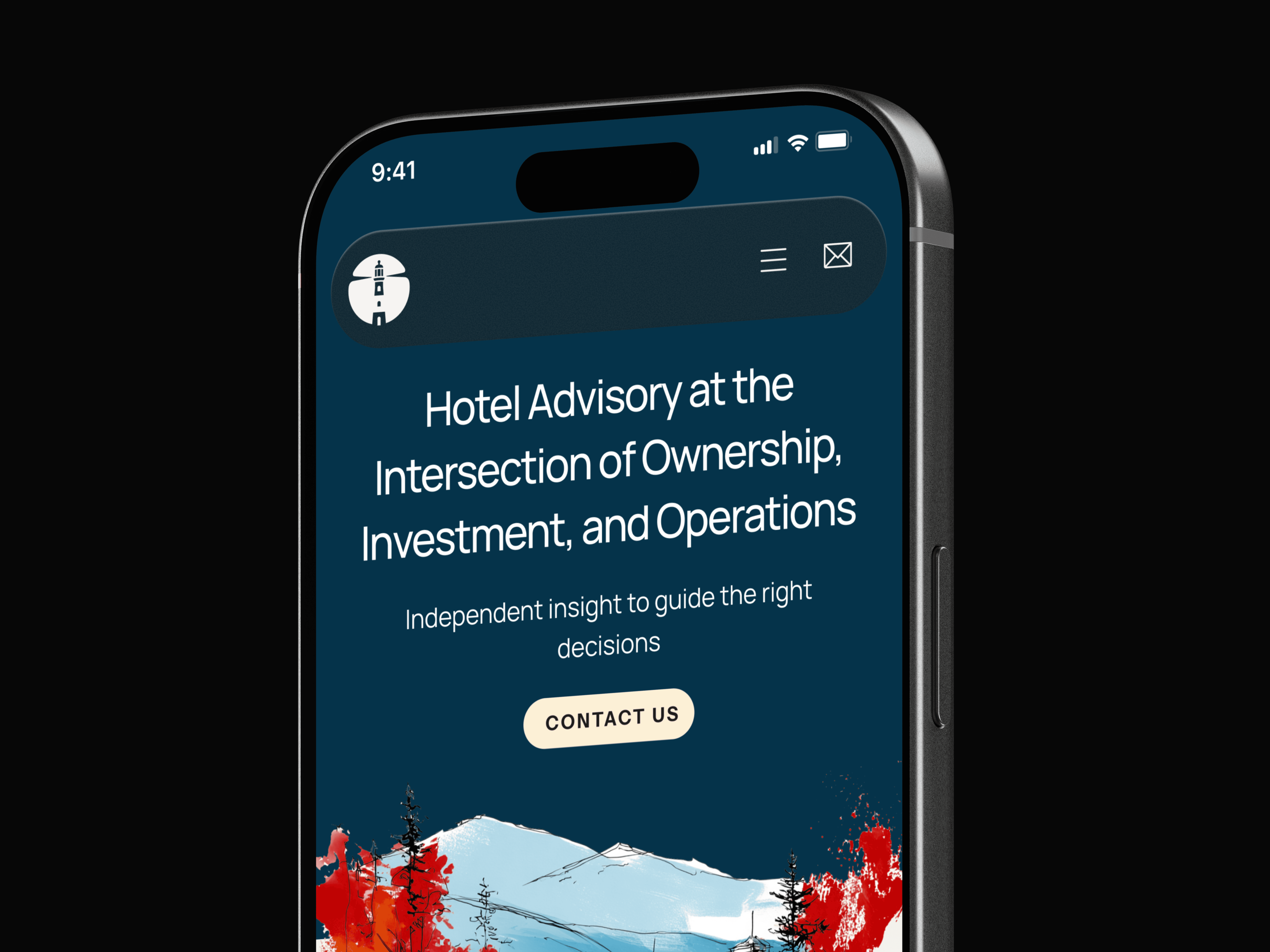
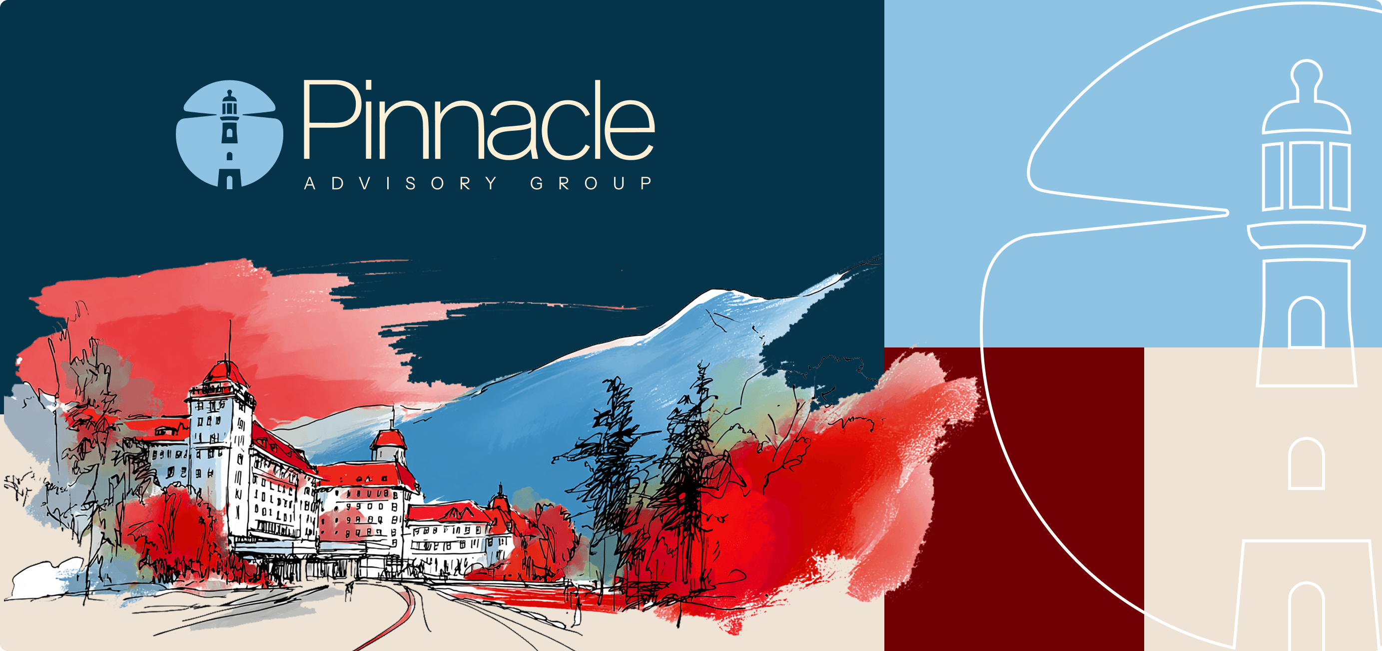
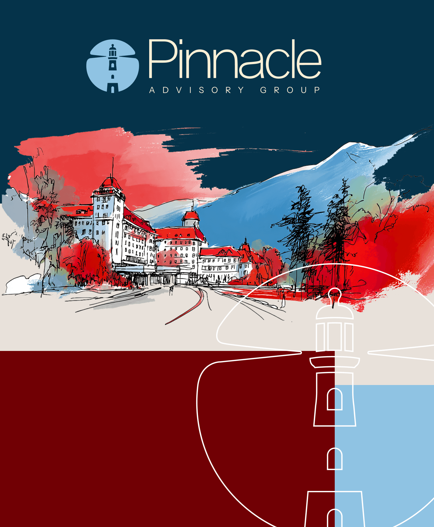
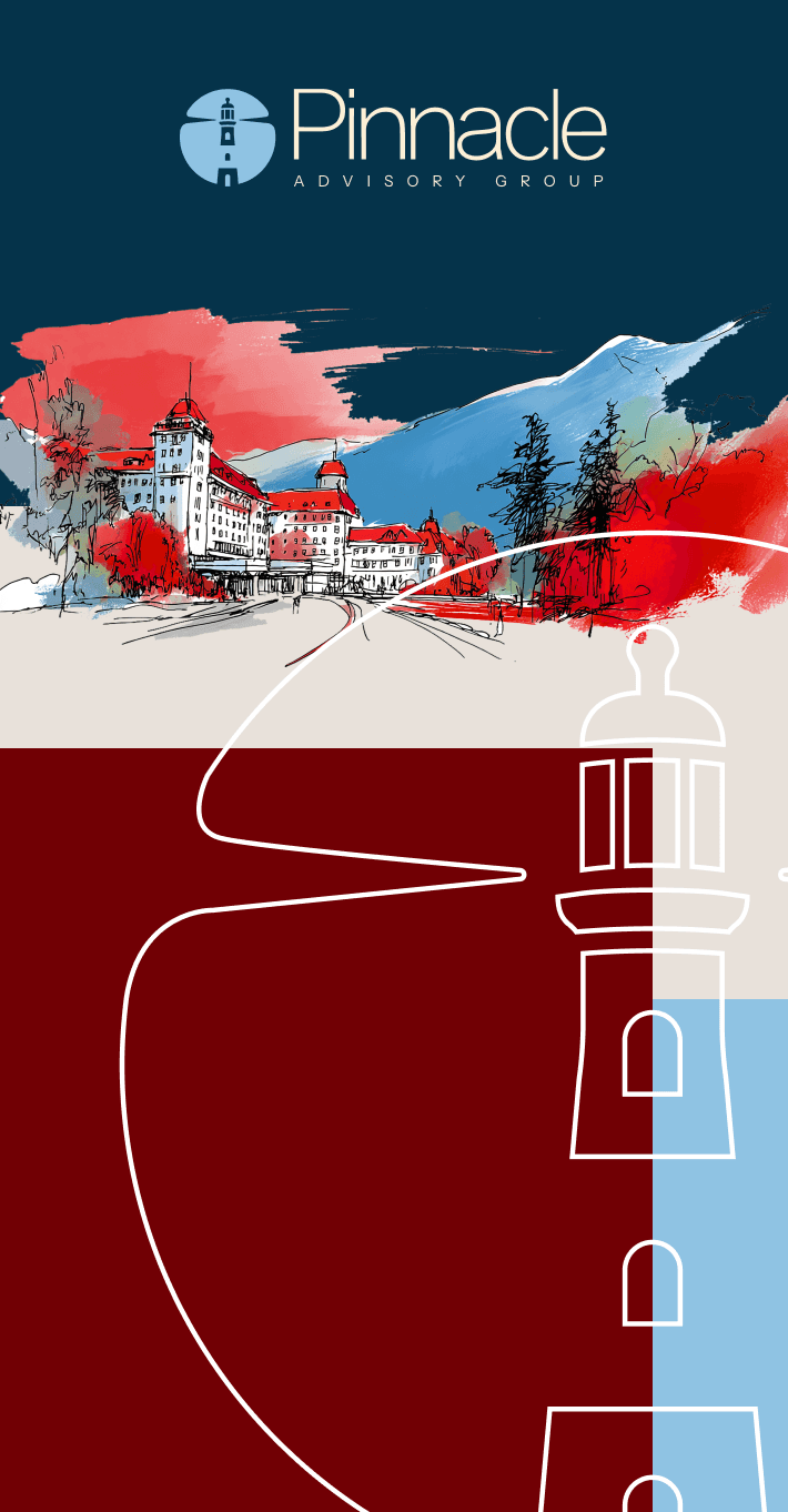
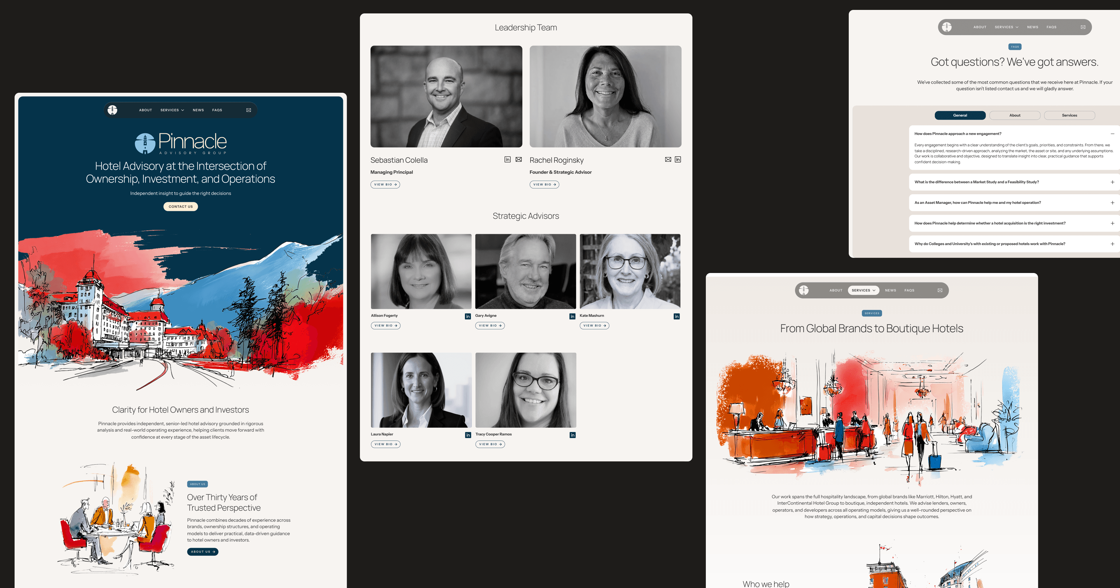
The logomark features a lighthouse silhouette anchored within a bold, circular form, set against a palette of Deep Atlantic navy and Beacon Red. The tower pierces the circle’s upper boundary, framed by two symmetrical beams that double as the horizon—an intentional, geometric composition that uses stark contrast to convey both strength and clarity. The luminous white lighthouse against the dark backdrop stands as a symbol of guidance in uncertain times: immediate, intuitive, and unmistakable.
The wordmark, rendered in a refined sans-serif, is at once precise and contemporary, imparting subtle institutional gravitas without rigidity. Paired together, the icon and wordmark establish a clear visual hierarchy that balances the warmth and humanity of the firm’s approach with the authority of its reputation.
The Brand Language
Pinnacle’s visual language revolves around the principle of strategic accompaniment—a trusted advisor who remains engaged throughout complexity, never disappearing after delivering a report. Every design choice reinforces this ethos of continuous partnership and presence.
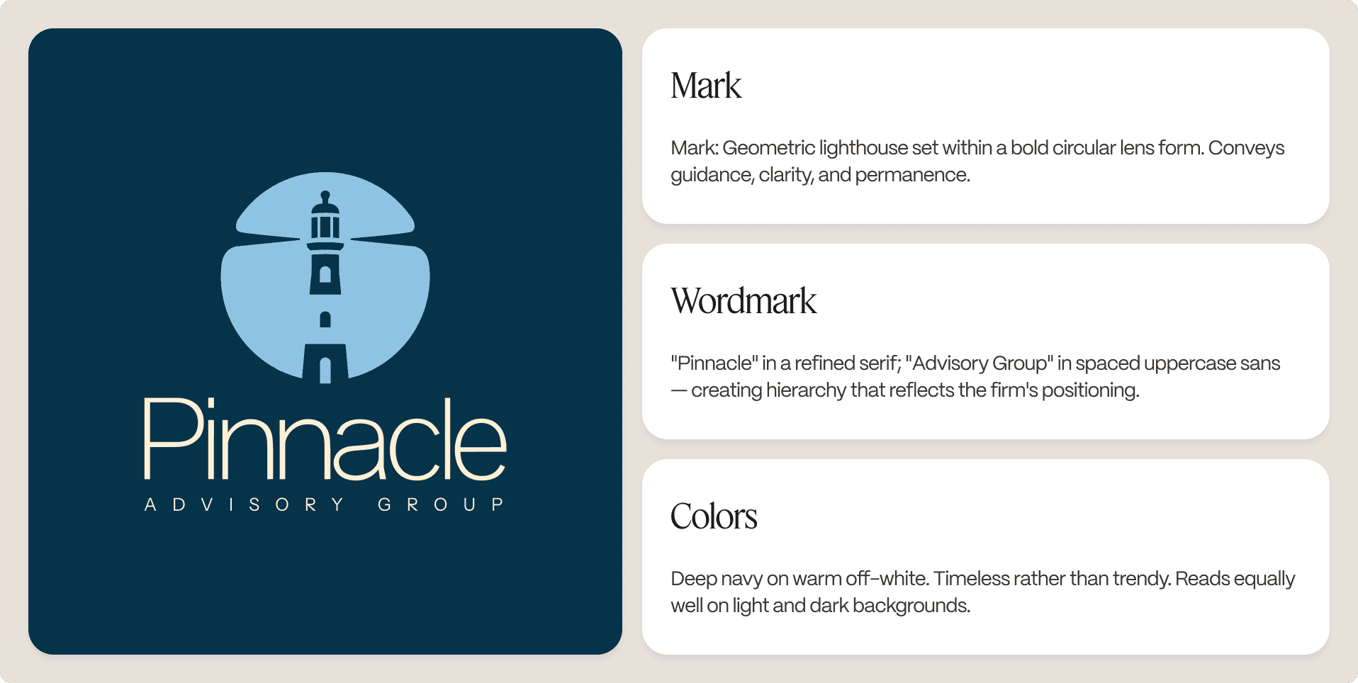
Deep Atlantic navy anchors the brand in nautical authority: rich, nuanced, and confidently serious. Beacon Red pierces the palette with purposeful intensity, reflecting the lighthouse’s unmistakable signal. The colors blend into a scheme that feels intrinsic and time-honored, as if the brand’s visual identity has always existed, only now revealed.
Typography amplifies these values. Manrope’s refined elegance lends headlines quiet assurance, while Instrument Sans provides technical precision and clarity to supporting details. This pairing echoes Pinnacle’s approach—broad authority balanced by meticulous attention to detail.
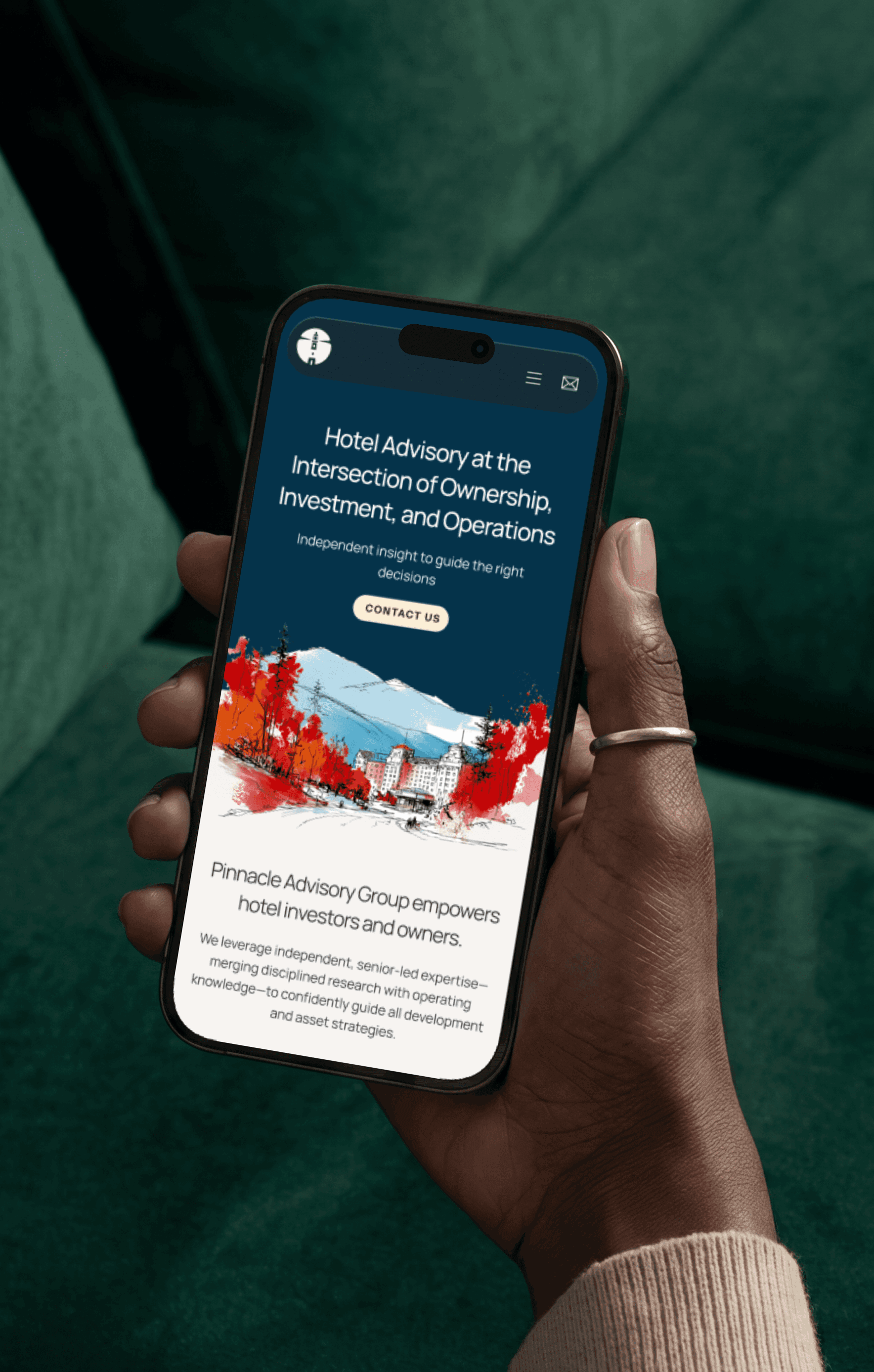
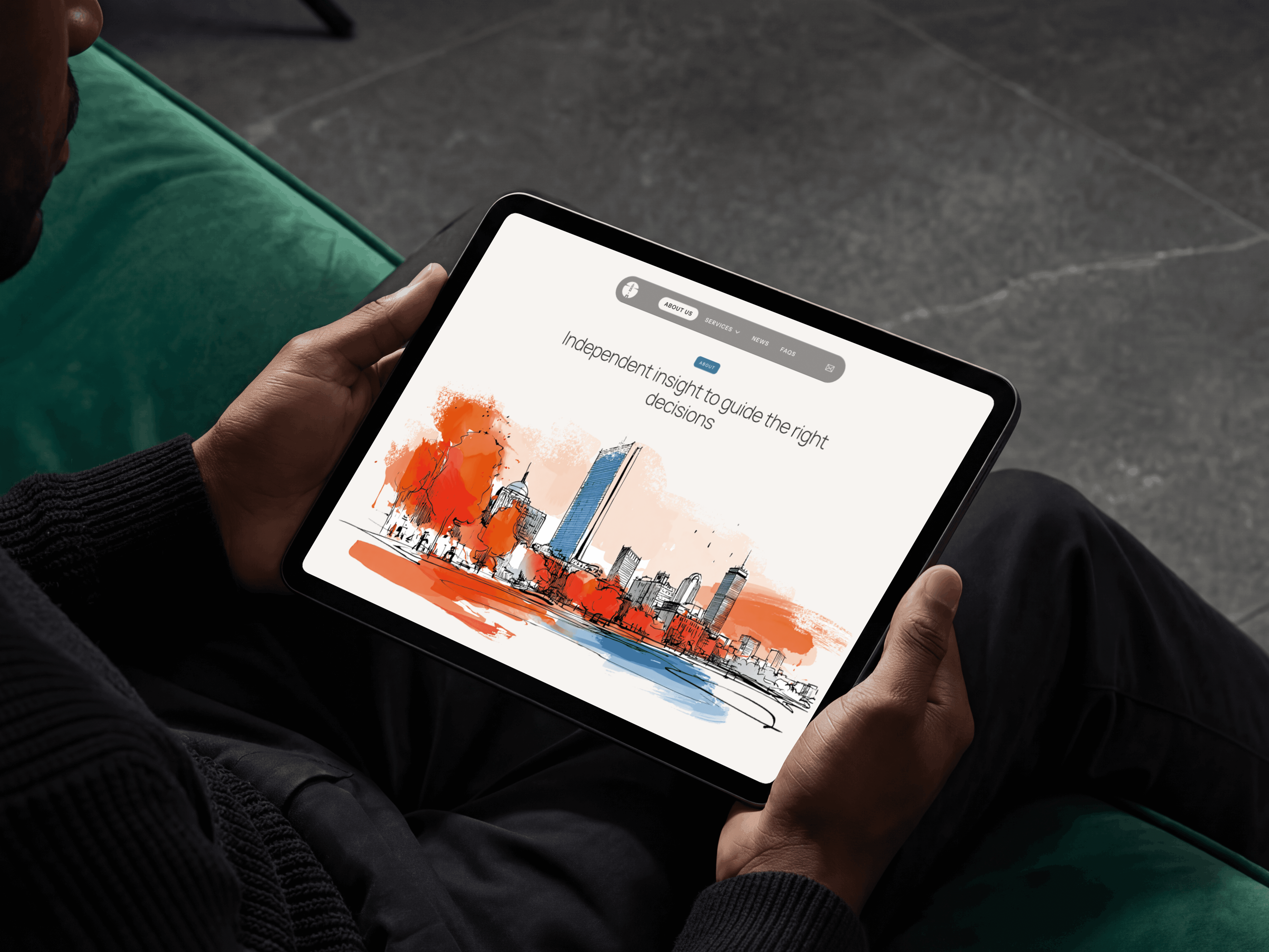
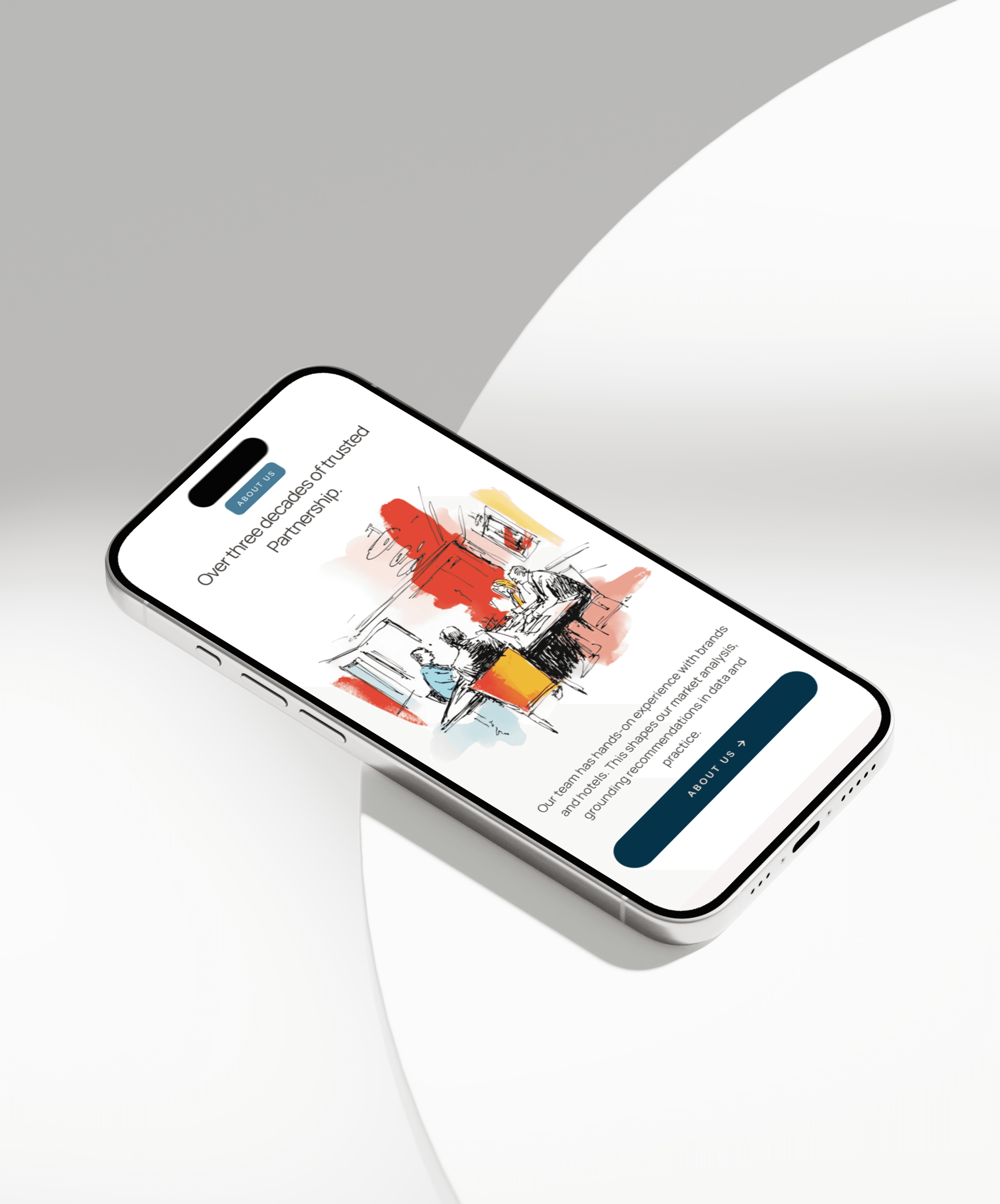
The most distinctive element is the gestural watercolor illustration. Replacing stock photography, each hand-rendered, atmospheric scene is unique and intentionally unhurried, communicating that Pinnacle treats every client and asset as singular. Where competitors settle for the generic, these illustrations signal careful, bespoke consideration.
The result: a visual identity that commands attention through substance—authoritative without coldness, distinctive without ornamentation.
the brand website
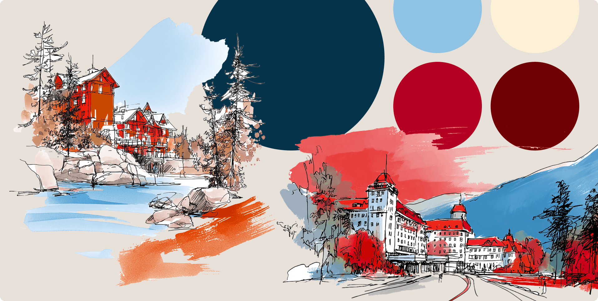
The website brief crystallized around three core needs: establish immediate credibility with hotel owners and operators, communicate Pinnacle's services without corporate jargon, and clearly differentiate a senior-led boutique firm from larger institutional competitors.
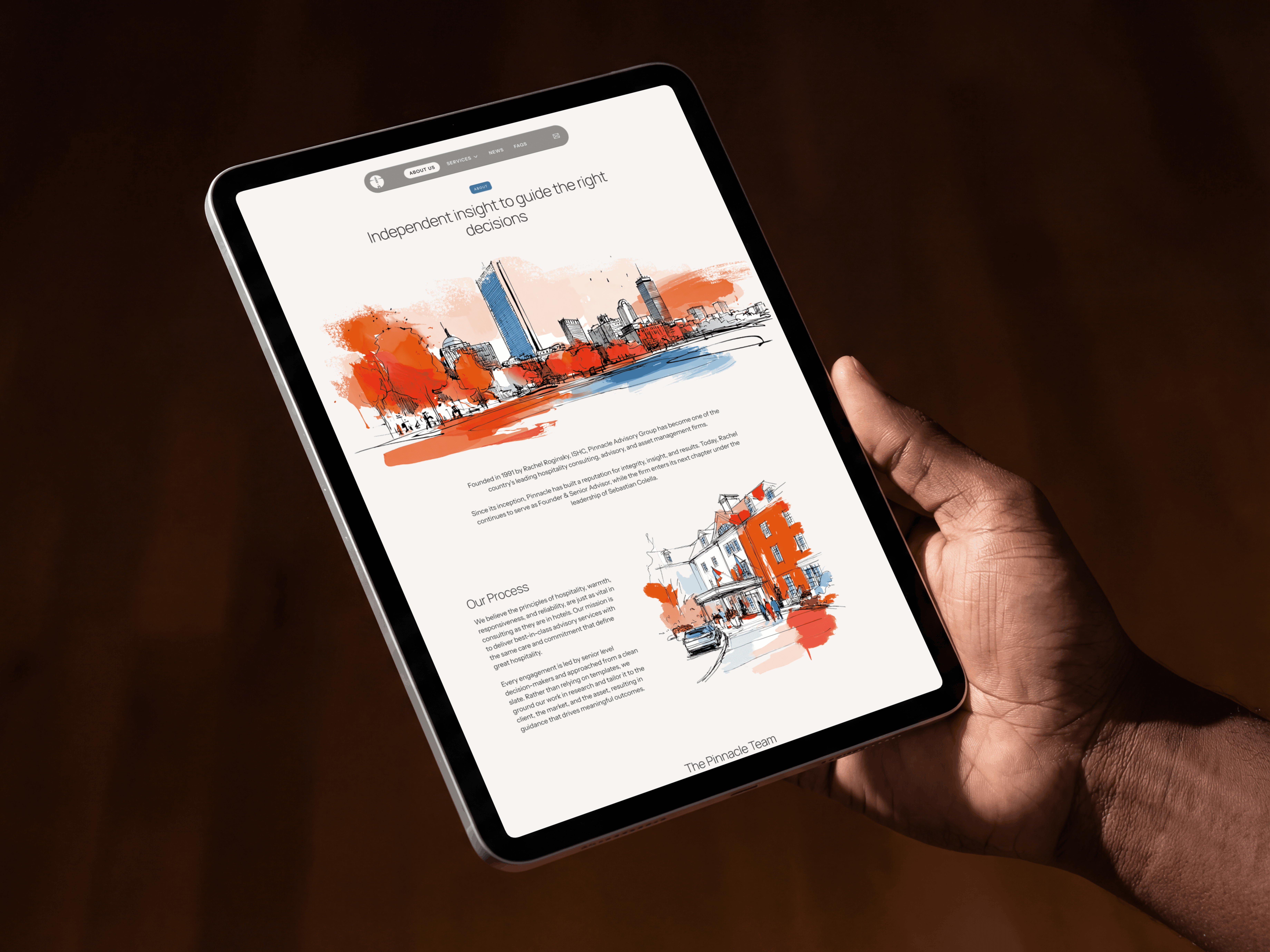
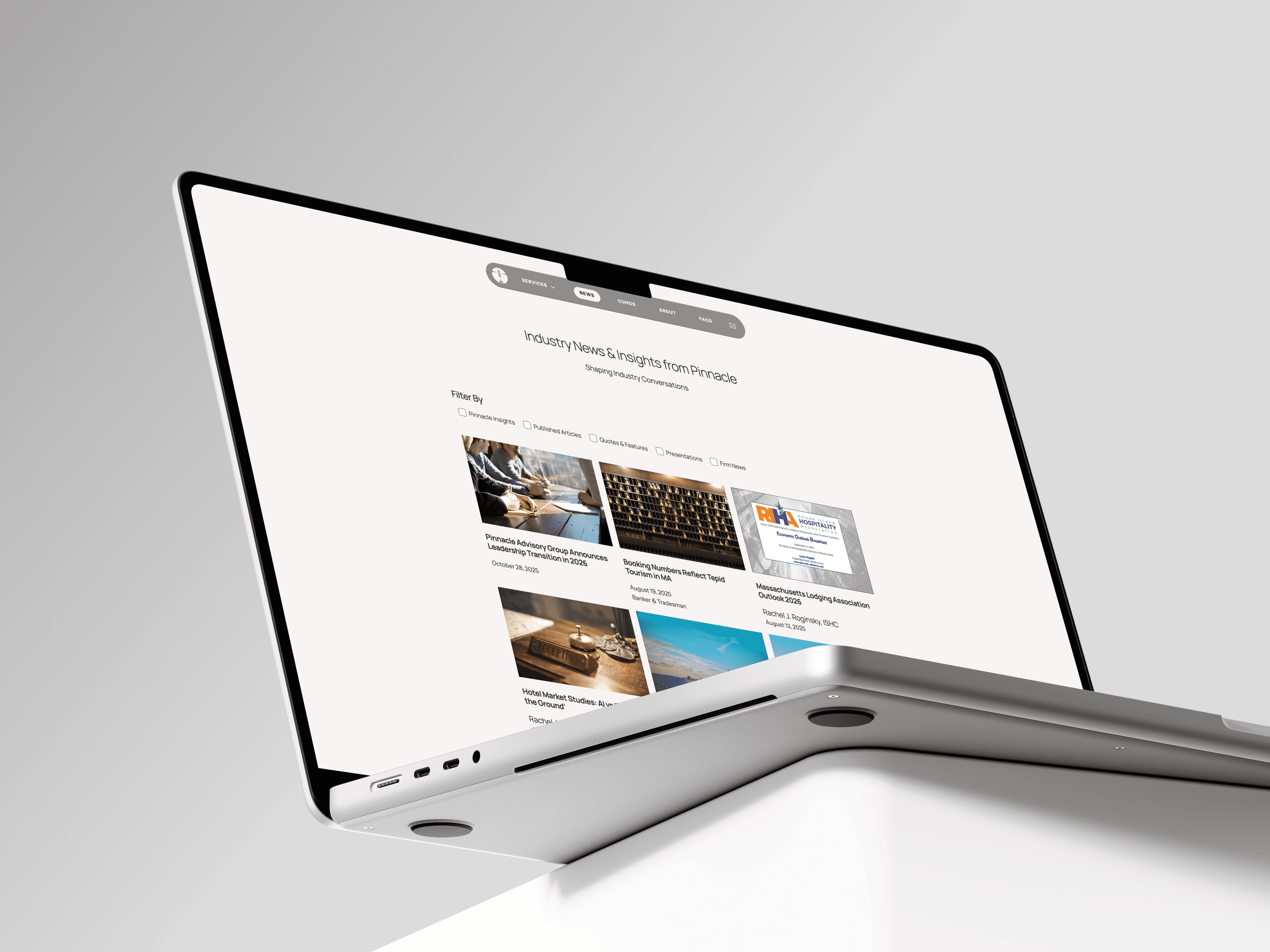
The process started with wireframes — every page was mapped for content hierarchy and user flow before any visual decisions were made. Structure first, always. Once the architecture was solid, the visual language came in, extending the brand system across 10+ pages: home, about, services overview, nine individual service pages, team, FAQs, news, and contact. Built in Webflow and fully responsive across all devices.
Every page was designed around a single UX goal with a distinct visual treatment. Progressive disclosure runs throughout — the services accordion communicates breadth without overwhelming; FAQ tabs allow self-selection; the about page leads with faces before credentials. The newsletter capture in the footer converts passive visitors into a warm audience without requiring an immediate commitment. Each decision was deliberate, and each one traces back to the same brief: make a 30-year firm feel immediately trustworthy to someone who has never heard of them.

THE OUTCOME
The brand identity system is complete — a distinctive lighthouse logomark, a refined typographic system, a cohesive color palette, and a custom illustration library that together give Pinnacle a presence as authoritative as its 30-year reputation.
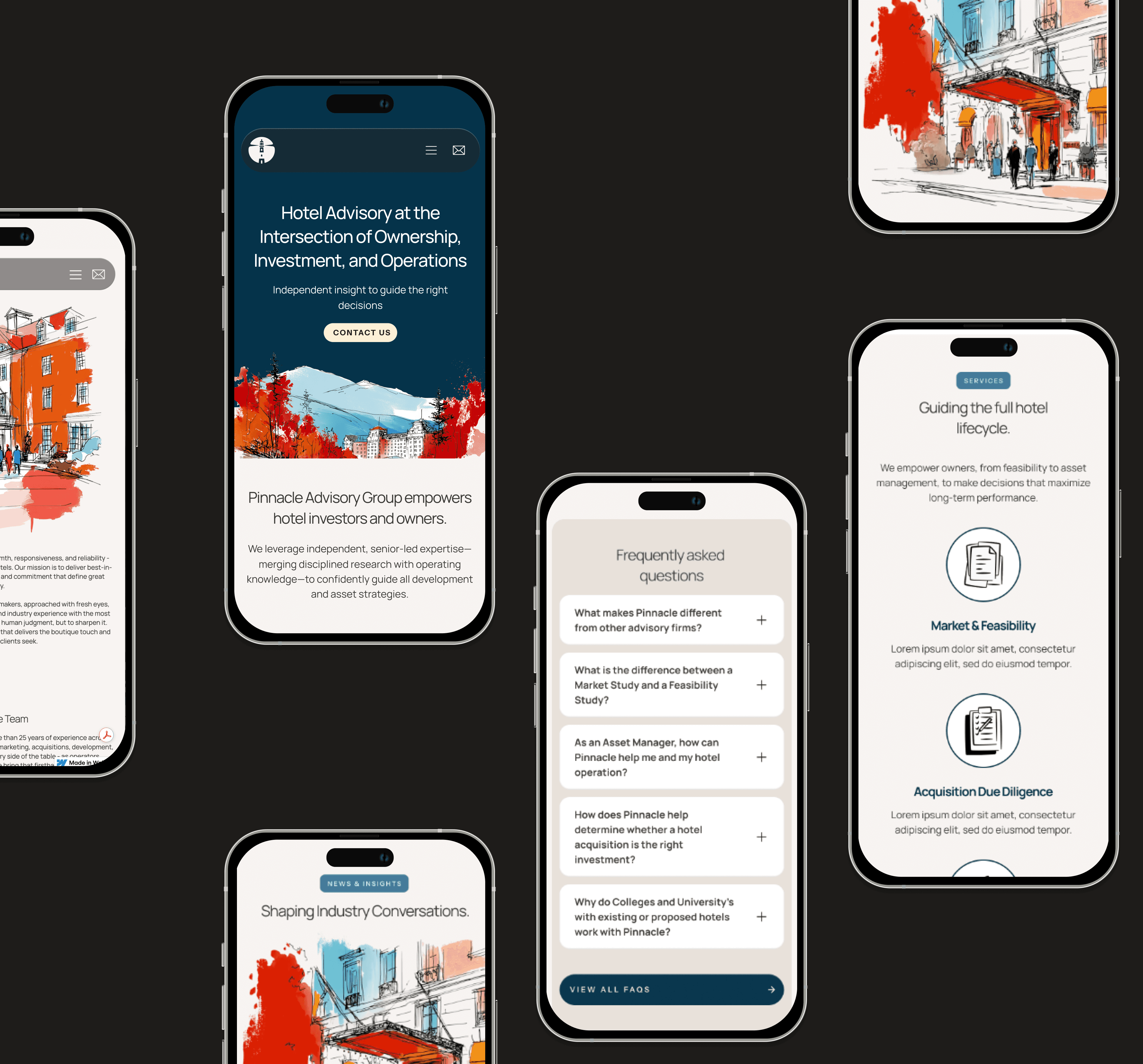
The Webflow website is now live — 10+ pages, fully responsive, built for hotel investors, developers, and operators making high-stakes advisory decisions. For the first time, Pinnacle's digital presence matches the depth and caliber of the work behind it.
For a firm that spent three decades as the best-kept secret in hospitality advisory, it was long overdue.
LEARNINGS
The Pinnacle project crystallized a principle I now consider foundational: resolve the brand fully before embarking on the web. Once a clear identity was established, the site’s design followed with clarity and direction.
The greater challenge became exercising restraint—making certain that bold illustrations, deep navy, and editorial typography complemented rather than competed. The key insight was to treat the lighthouse not simply as a visual metaphor, but as a functional promise: clients turn to Pinnacle for orientation and clarity, so every detail—from the logomark to the accordion FAQ—had to reinforce that purpose. The result is a website that feels enduring from its first day online.
If I were to expand this work further, motion would be integral from the outset; the illustrations are inherently cinematic, and that tale remains unfinished.