Timeline
March to April 2023
Role
Digital Experience Director
Industry
Healthcare
The Background
Headway is one of the fastest-growing mental health platforms in the U.S. — connecting patients, providers, and insurers to make mental healthcare more accessible. It handles the administrative burden of running a practice: credentialing, billing, compliance — so 70,000+ independent therapists, psychologists, and psychiatrists can stay focused on patient care across 300,000 appointments every month.
The Challenge
Headway's growth depends entirely on one thing: keeping providers credentialed, compliant, and focused on patient care — not paperwork. The problem was that compliance was actively working against that. Resources were buried in legal jargon, scattered across multiple locations, and felt more like enforcement than support. Providers called it "audit anxiety." Every hour spent navigating documentation was an hour not spent with patients — and every frustrating compliance experience was quietly eroding the provider trust that Headway's entire business model depends on.

The Strategy
From "billing tool" to "practice partner."
I led the website design — translating a strategic reframe into a concrete information architecture that providers would actually trust and use.
The central decision was architectural: stop organizing compliance content the way insurers think about it — by legal requirement — and start organizing it the way clinicians actually experience it — as a journey through their workday.
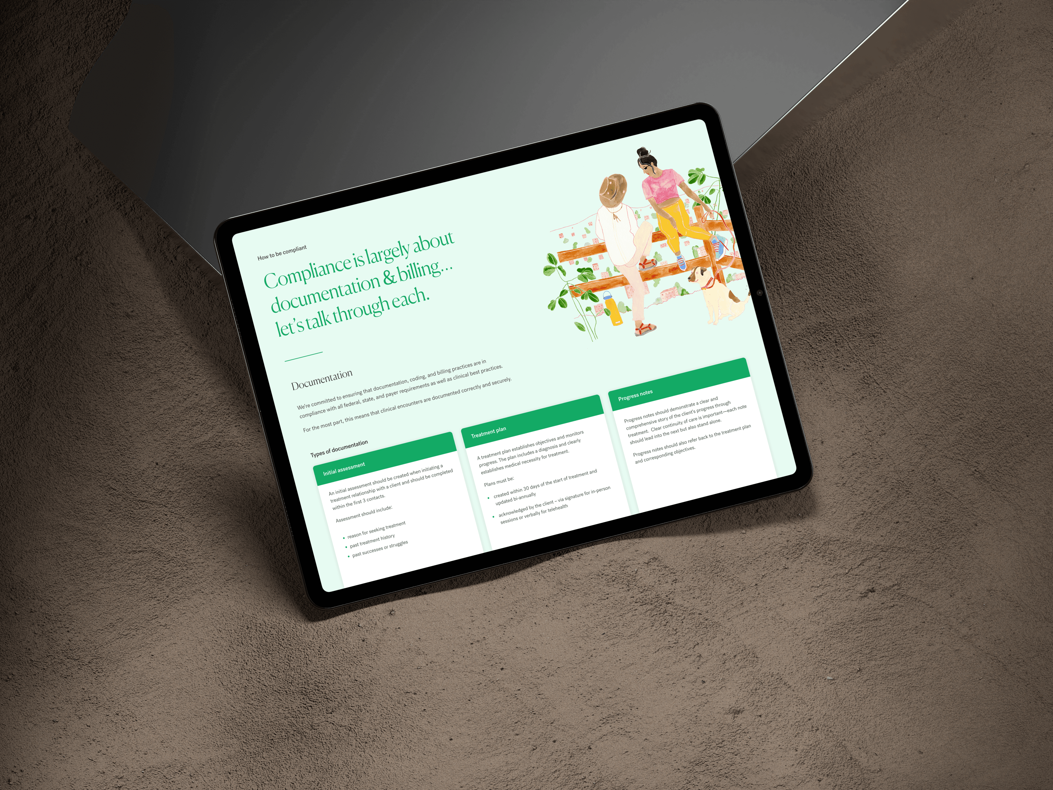
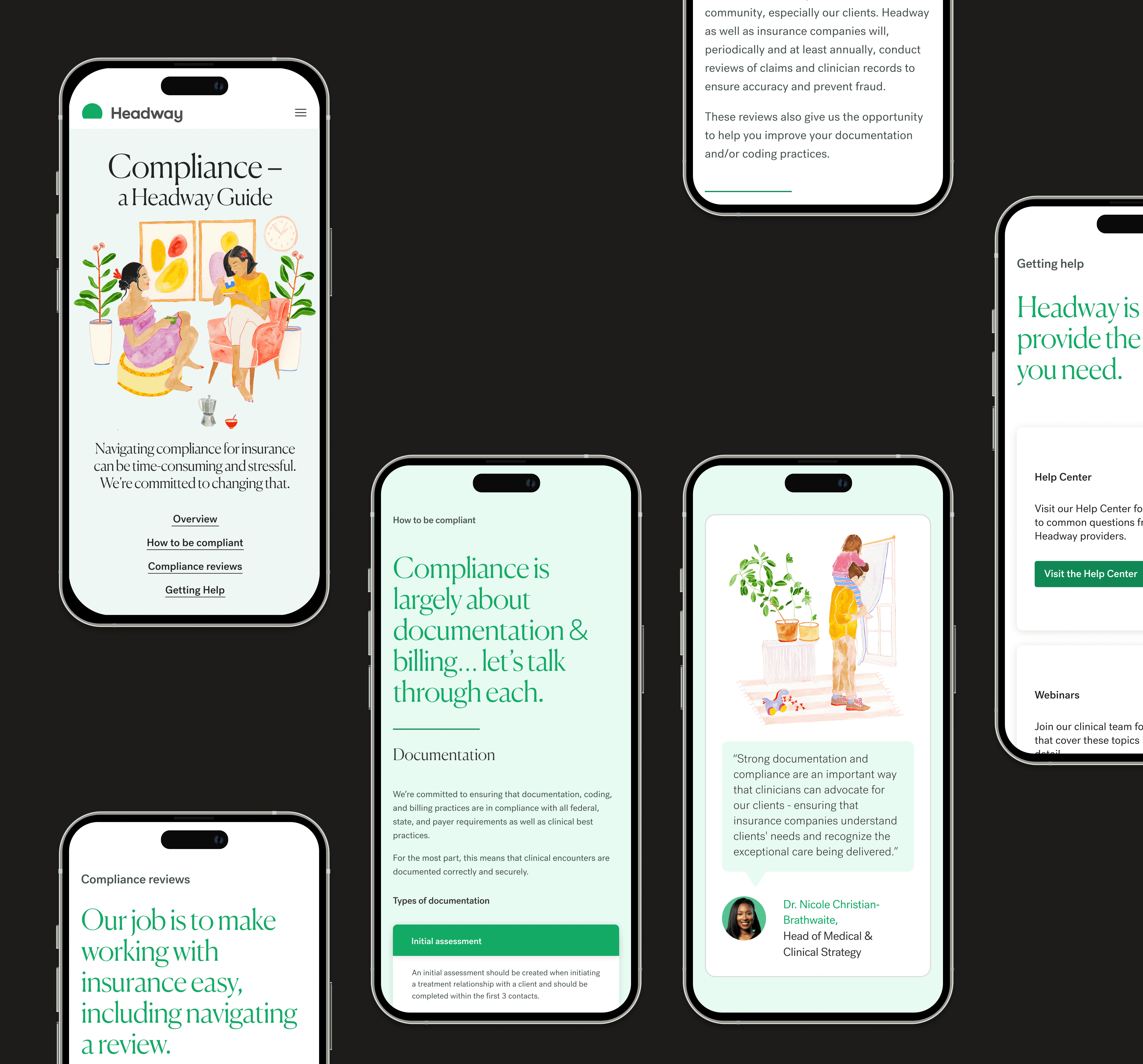
We proposed and designed the "Golden Thread" framework: a single-page compliance hub built around four sequential pillars that mirror a provider's real-world workflow:
The Why — compliance reframed as professional growth, not a mandate.
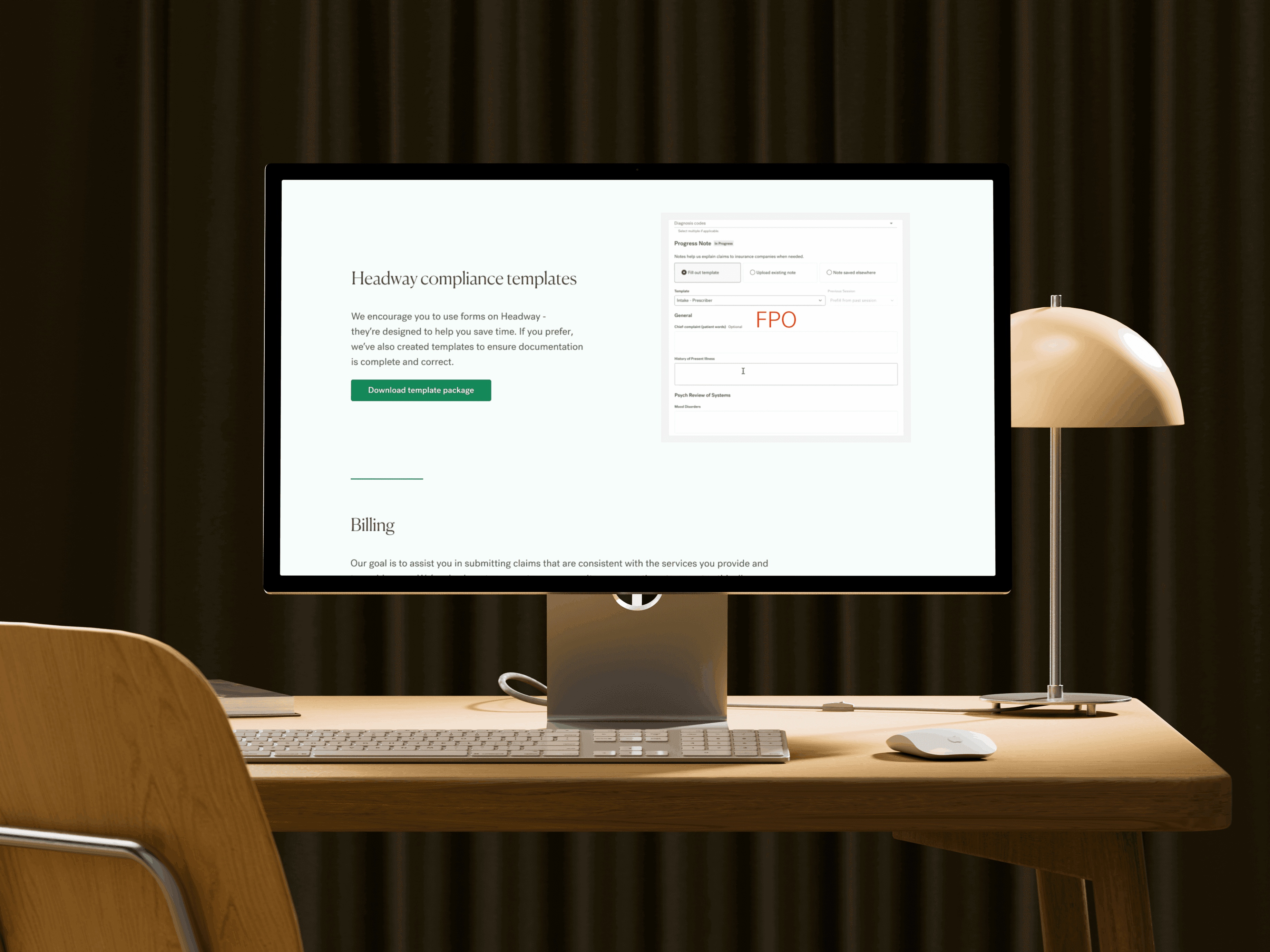
The How — actionable templates for SOAP notes and treatment plans, ready to use immediately.
The What — plain-language audit expectations with no jargon.
The Support — direct access to Headway's expert team at the end of every pathway.
Progressive disclosure throughout — expandable FAQs, tabbed interfaces — let providers opt into detail rather than being buried in it upfront.
The Solution
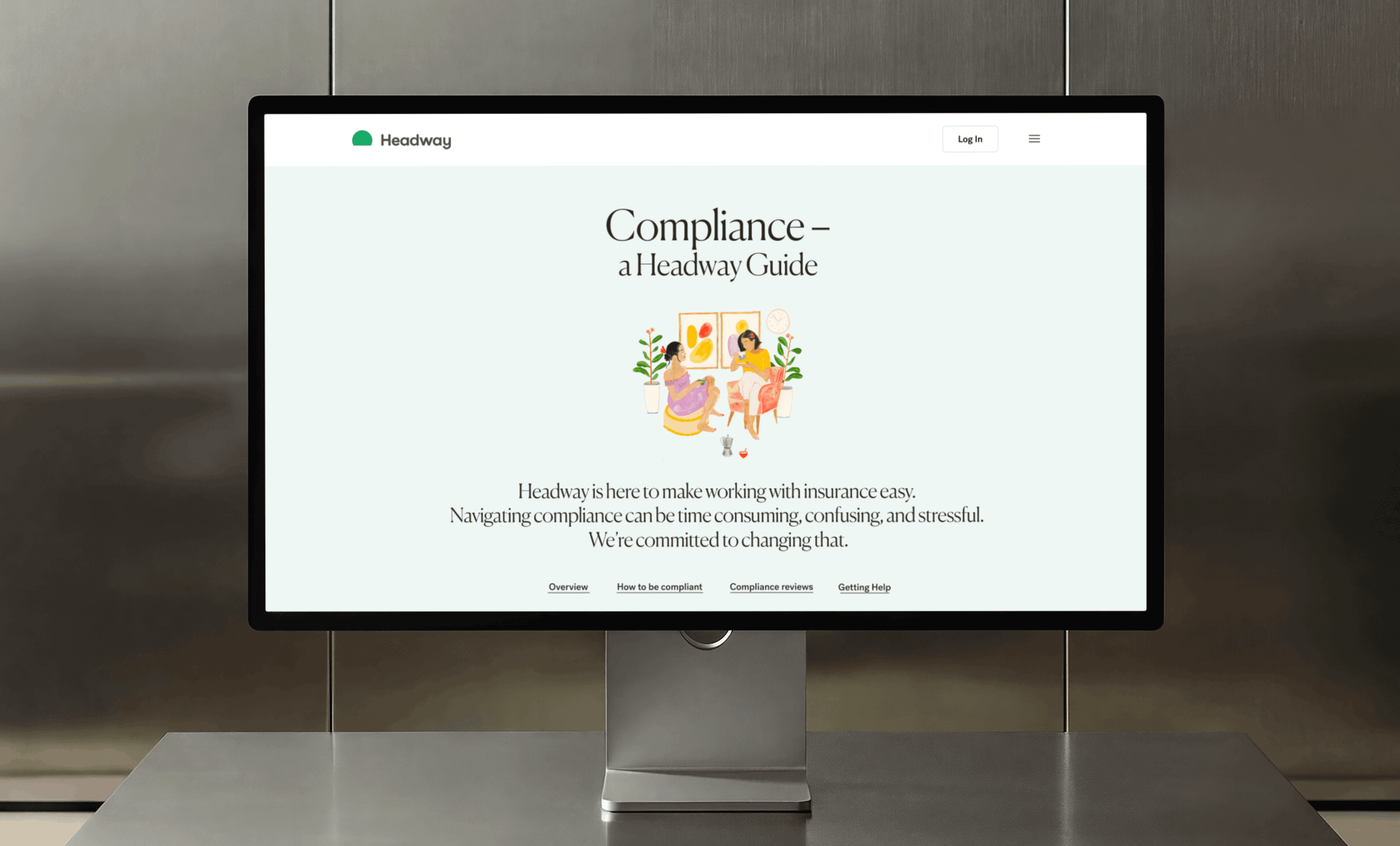
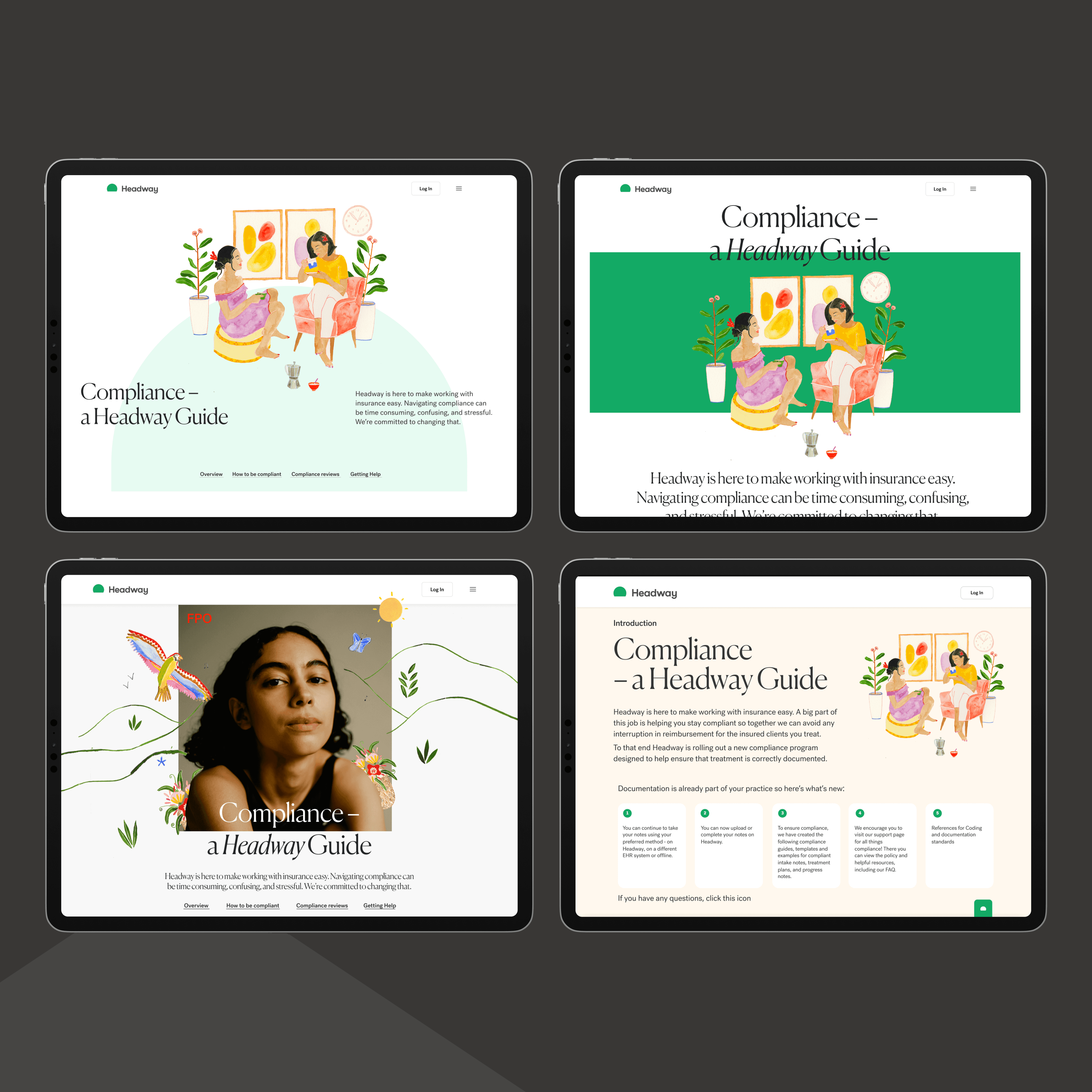
The new compliance hub replaced fragmented PDFs and scattered materials with a single structured resource — the first place providers could find everything without switching tabs or navigating legal documents.
The design made one core bet: compliance anxiety is a design problem, not a content problem. Providers weren't failing to comply because information was missing. They were failing because every touchpoint communicated "you're being monitored" rather than "we're here to help."
The Outcome
Centralizing scattered documentation into one coherent experience increased adoption of Headway's documentation templates — providers who had previously ignored compliance resources began engaging because the experience finally felt like support rather than enforcement.
Three things this project proved:
Clarity is a product decision. Shaping content around what providers actually worry about — not what insurers require — reduced cognitive load and made compliance feel manageable.
Information architecture is as strategic as visual design. Replacing scattered materials with a single structured hub didn't just look better — it changed behavior.
Narrative reframes drive adoption. Shifting from "mandatory requirement" to "practice partner" converted compliance from friction into value.